Block Kit Strategy
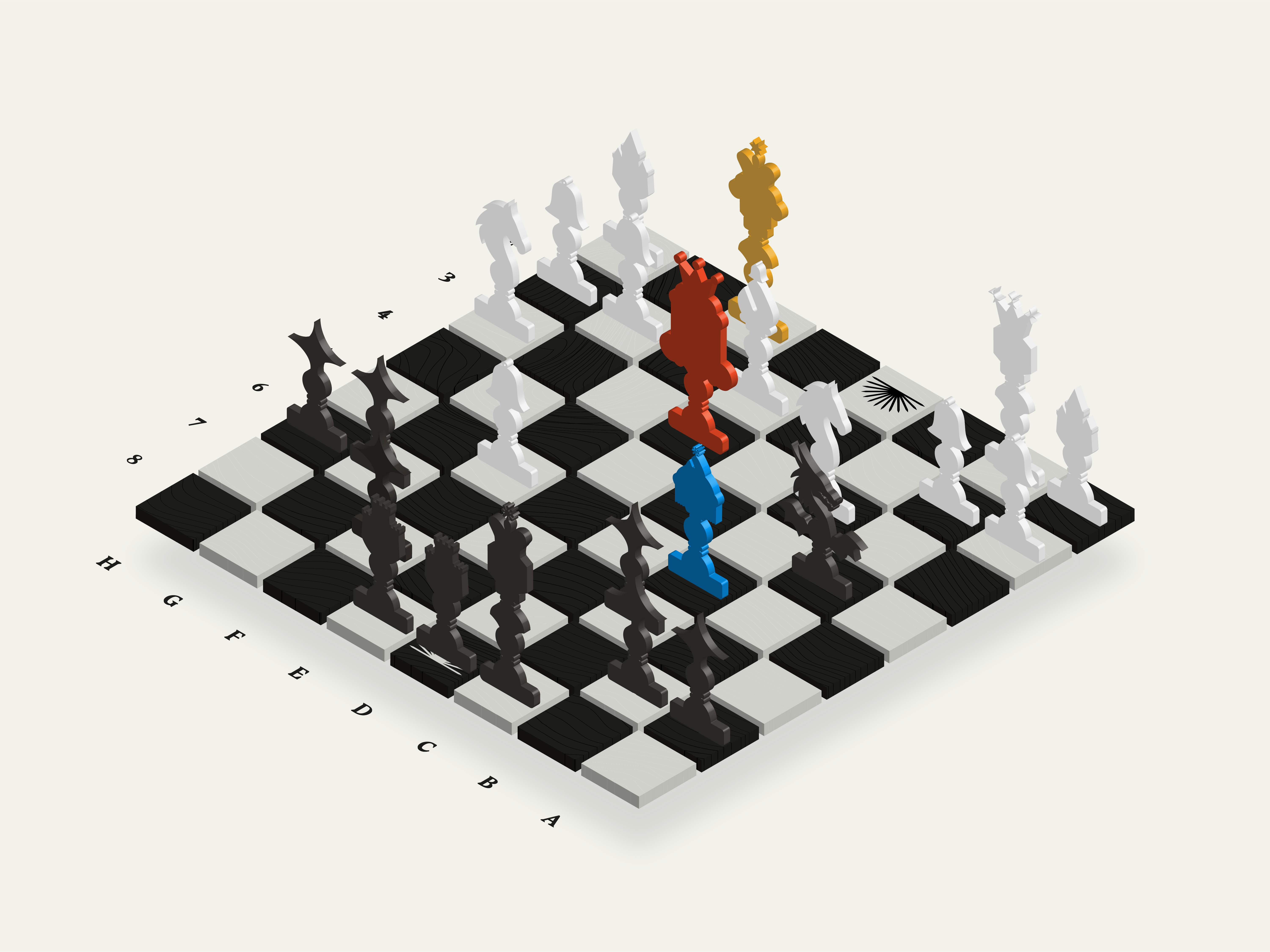
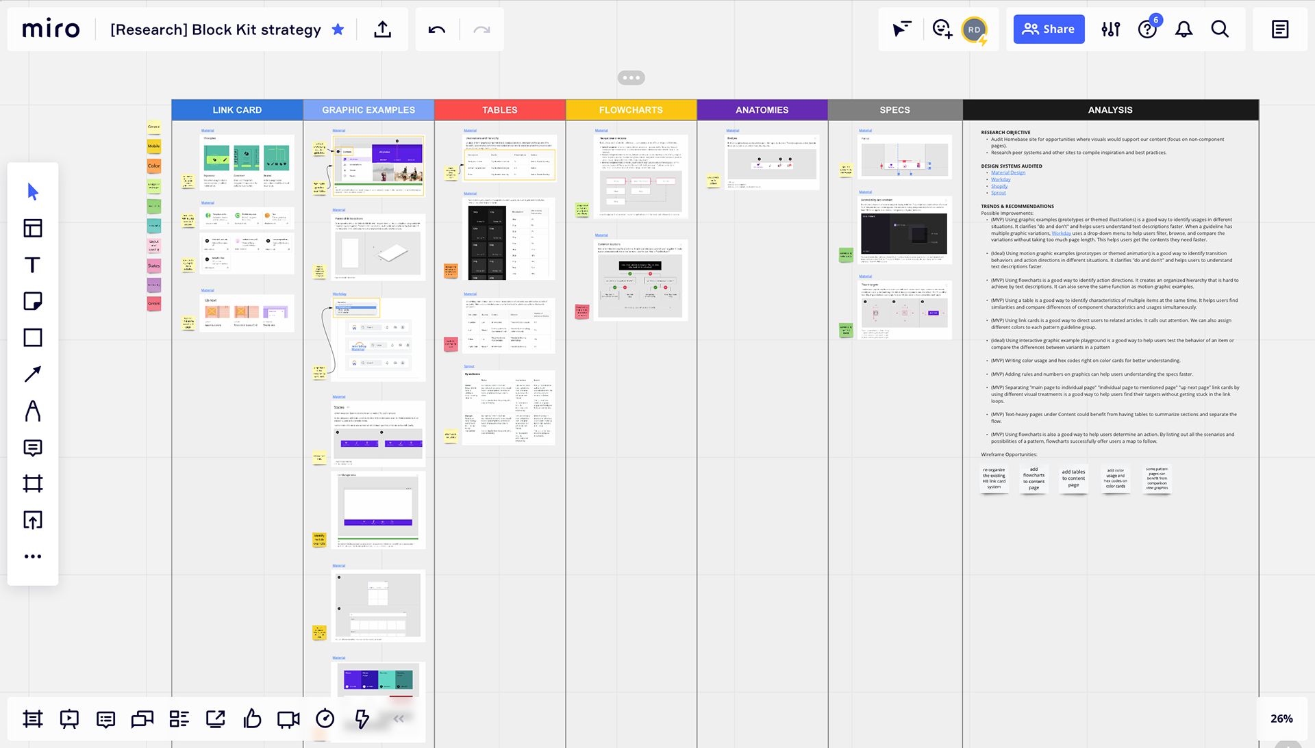
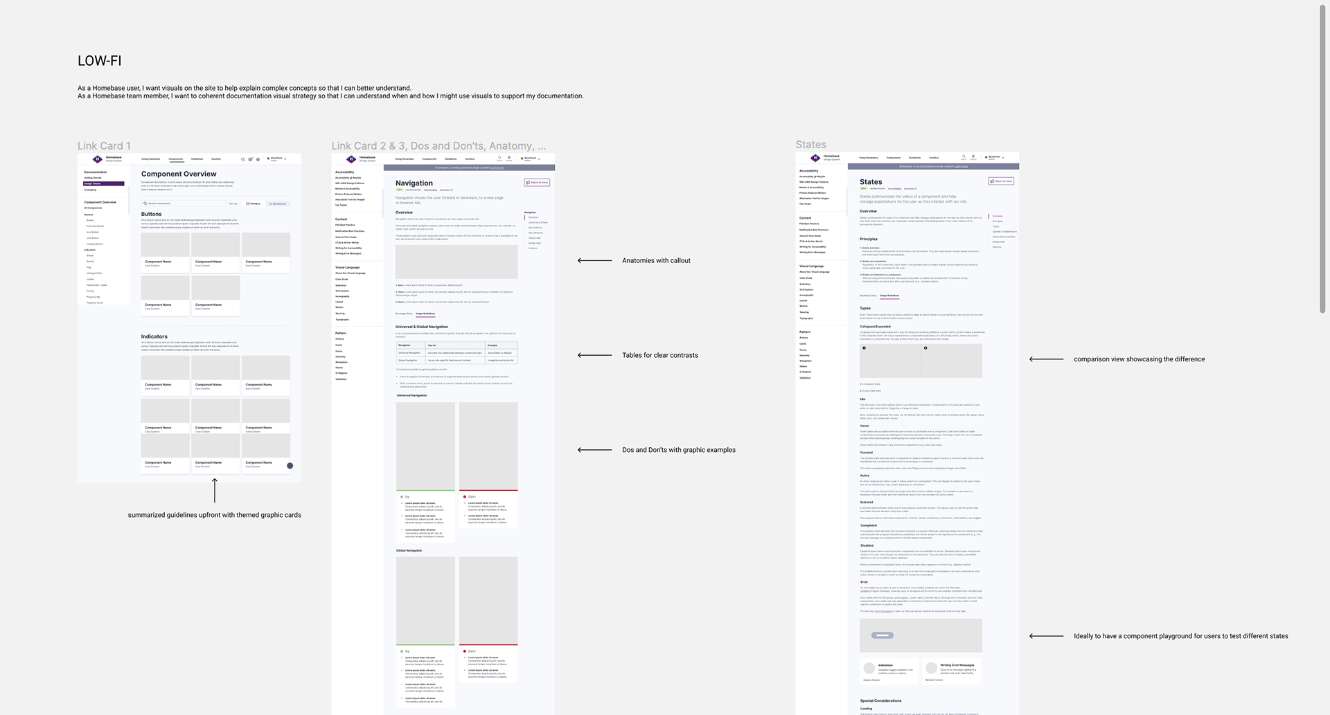
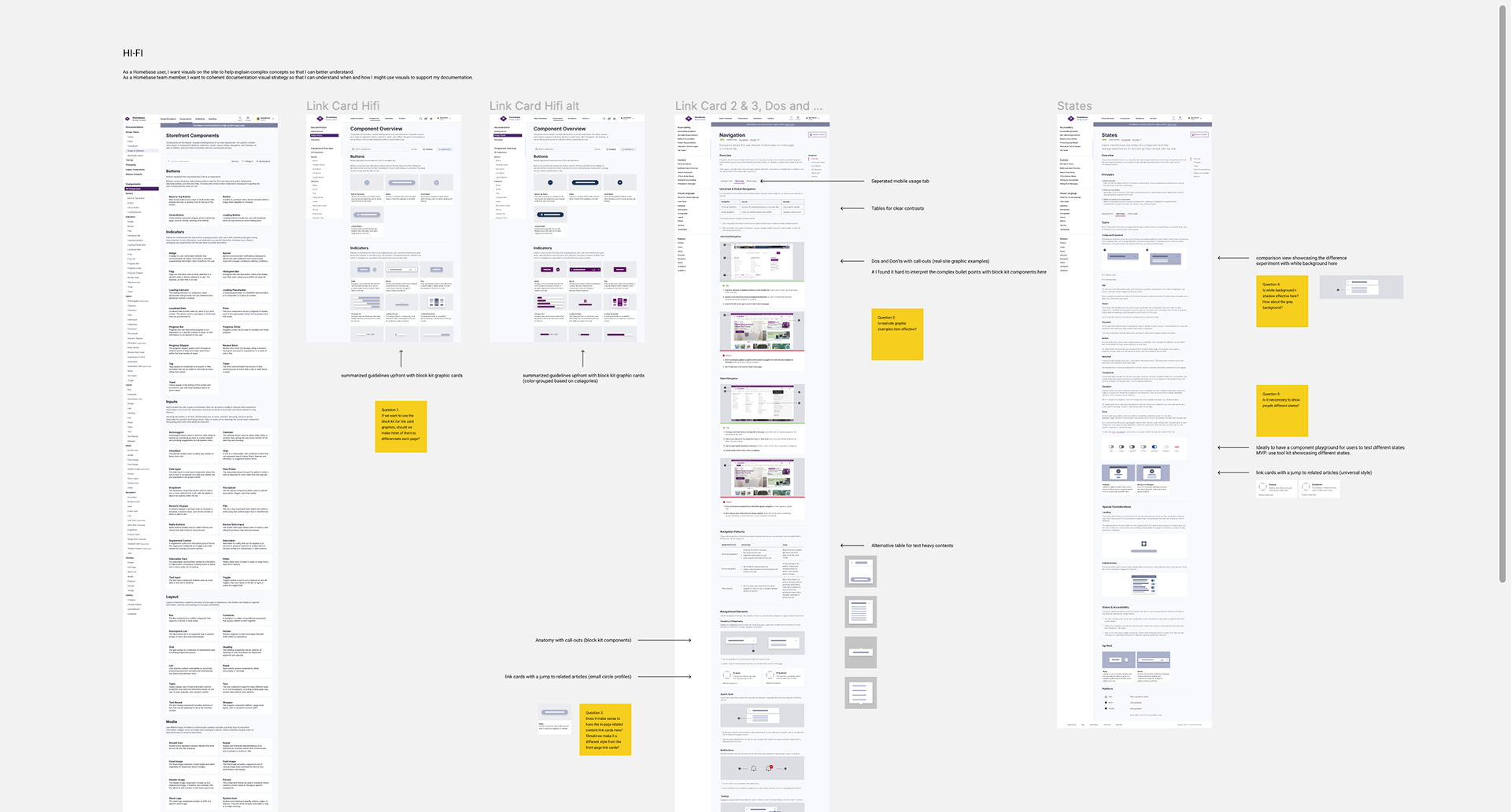
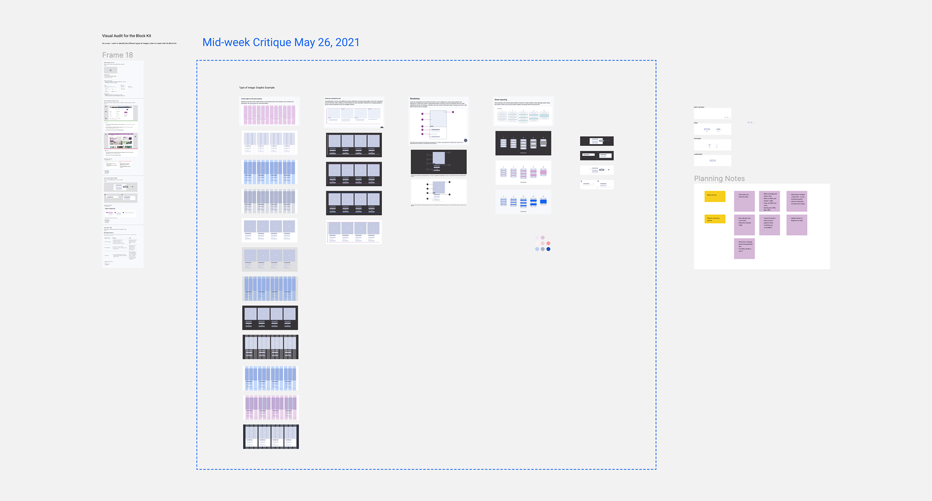
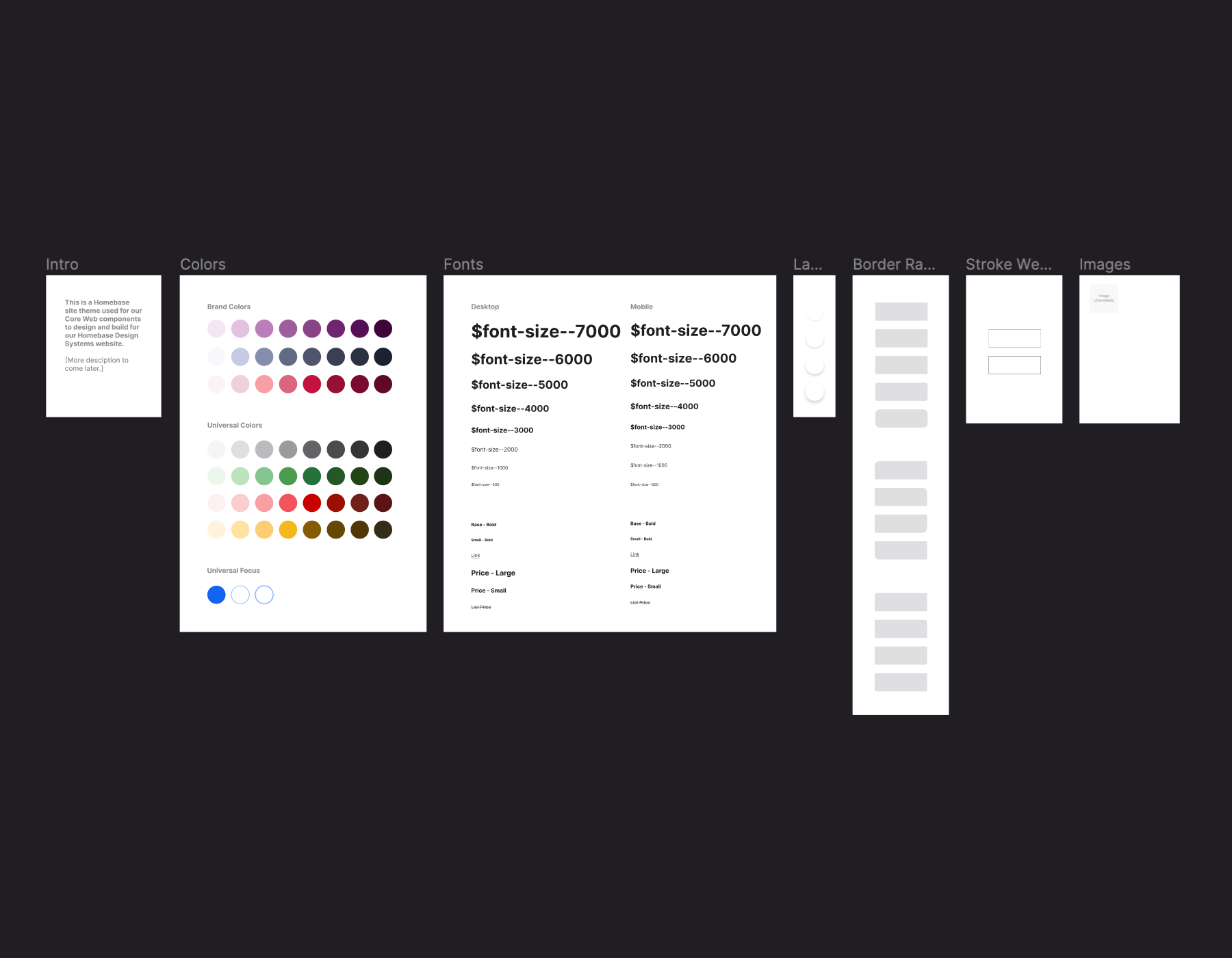
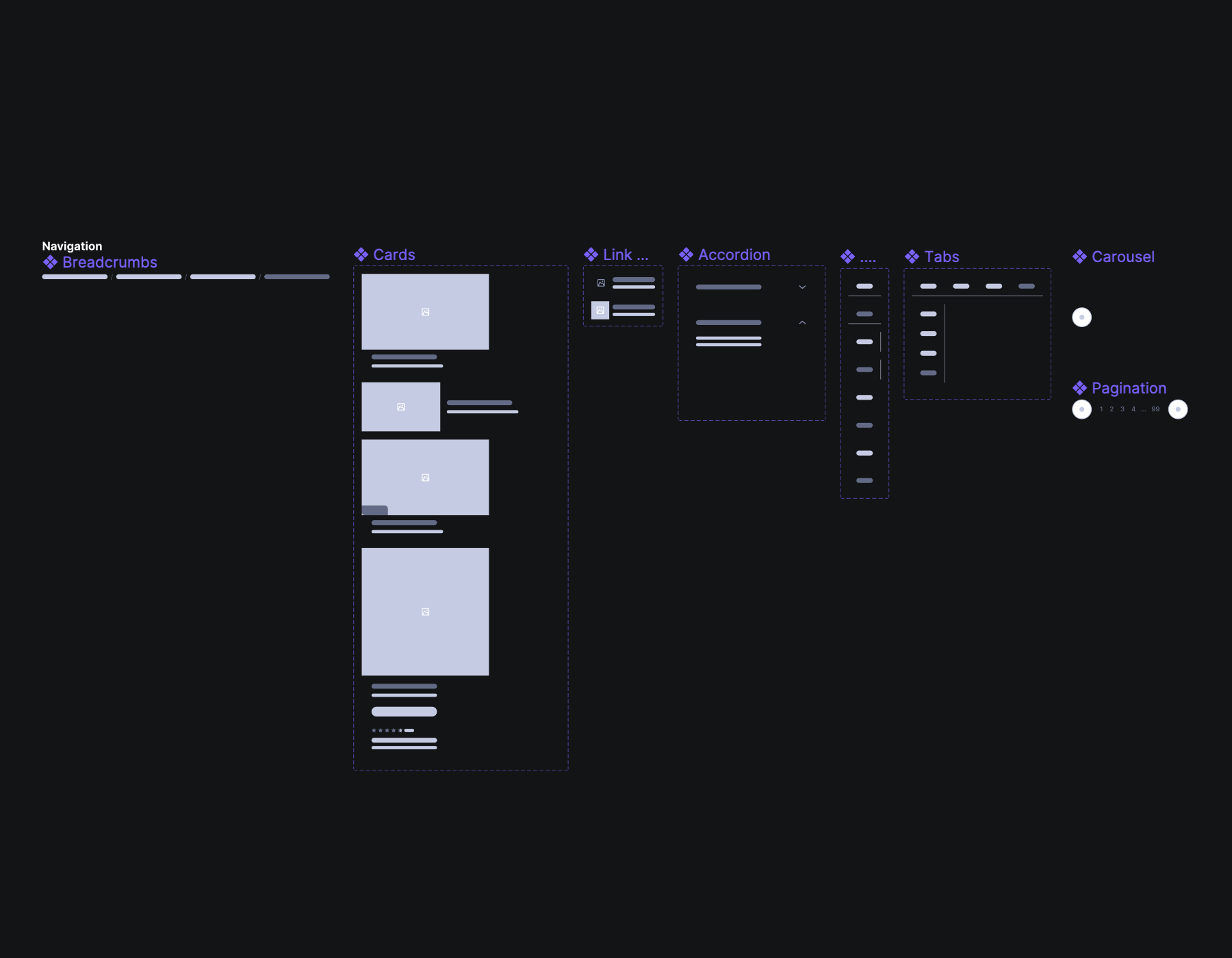
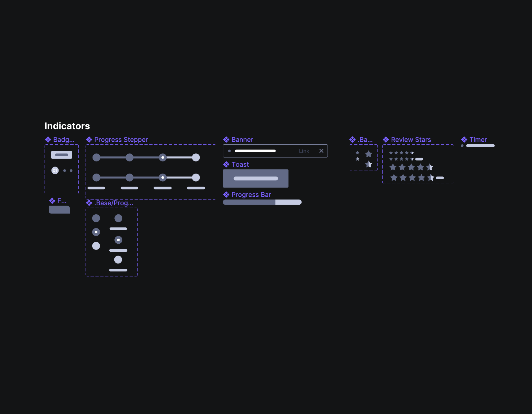
When working on the Homebase Design System, we noticed that documentation visuals often felt inconsistent and didn’t always help users understand more complex concepts. To solve this, we introduced the Block Kit, a non-branded visual library designed to work seamlessly across multiple themes including Wayfair, AllModern, and Partner Home. As the team rebuilt the Block Kit in Figma, I used the moment to step back and rethink how imagery could better support learning, focusing on when visuals truly add clarity versus when they add noise. By grounding all imagery in either live demos or Block Kit assets, we created a more cohesive visual language that made the complex system concepts easier to understand and gave internal teams clearer guidance on how to use visuals with intention.
Status Indicator Design & User Testing
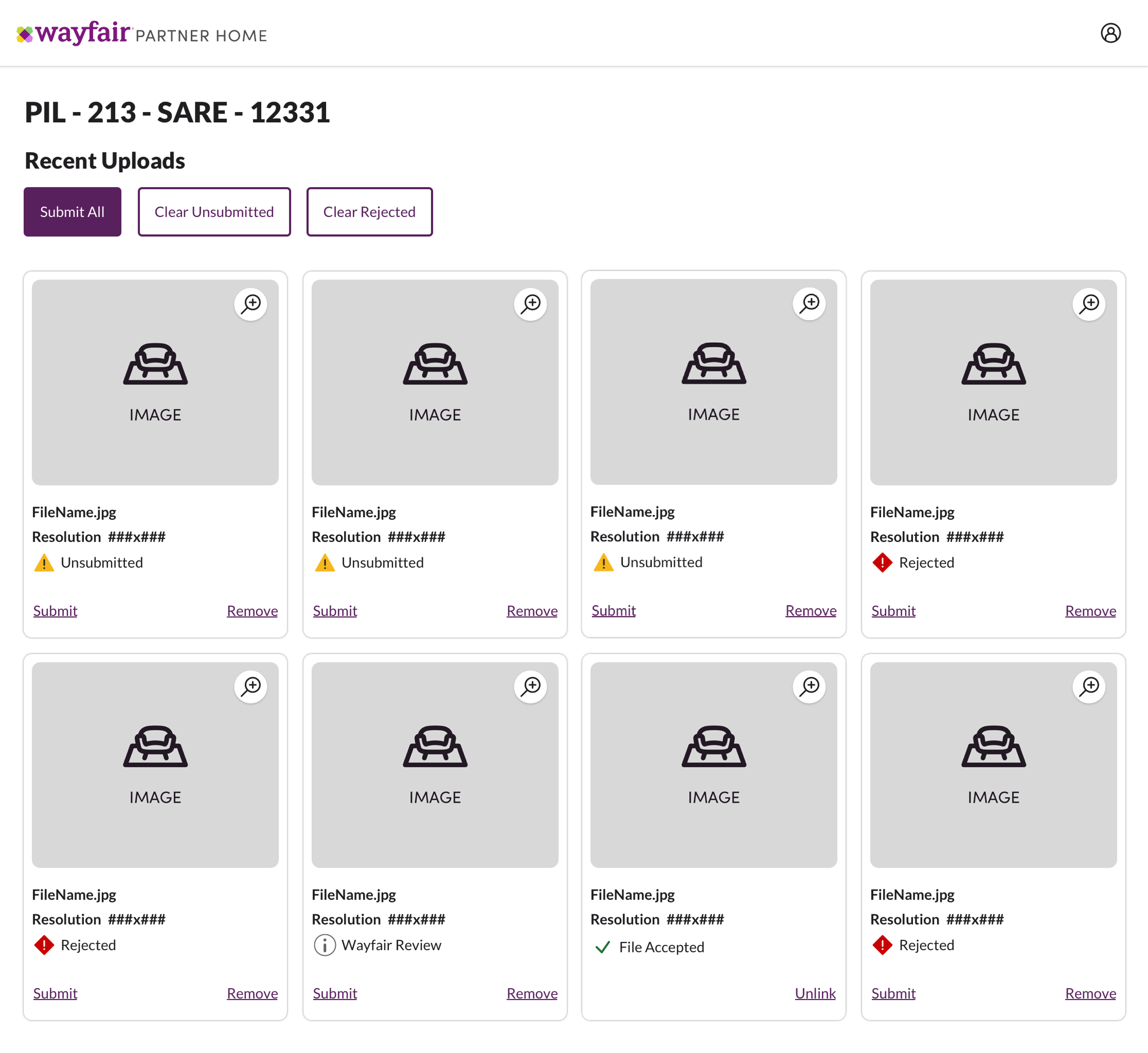
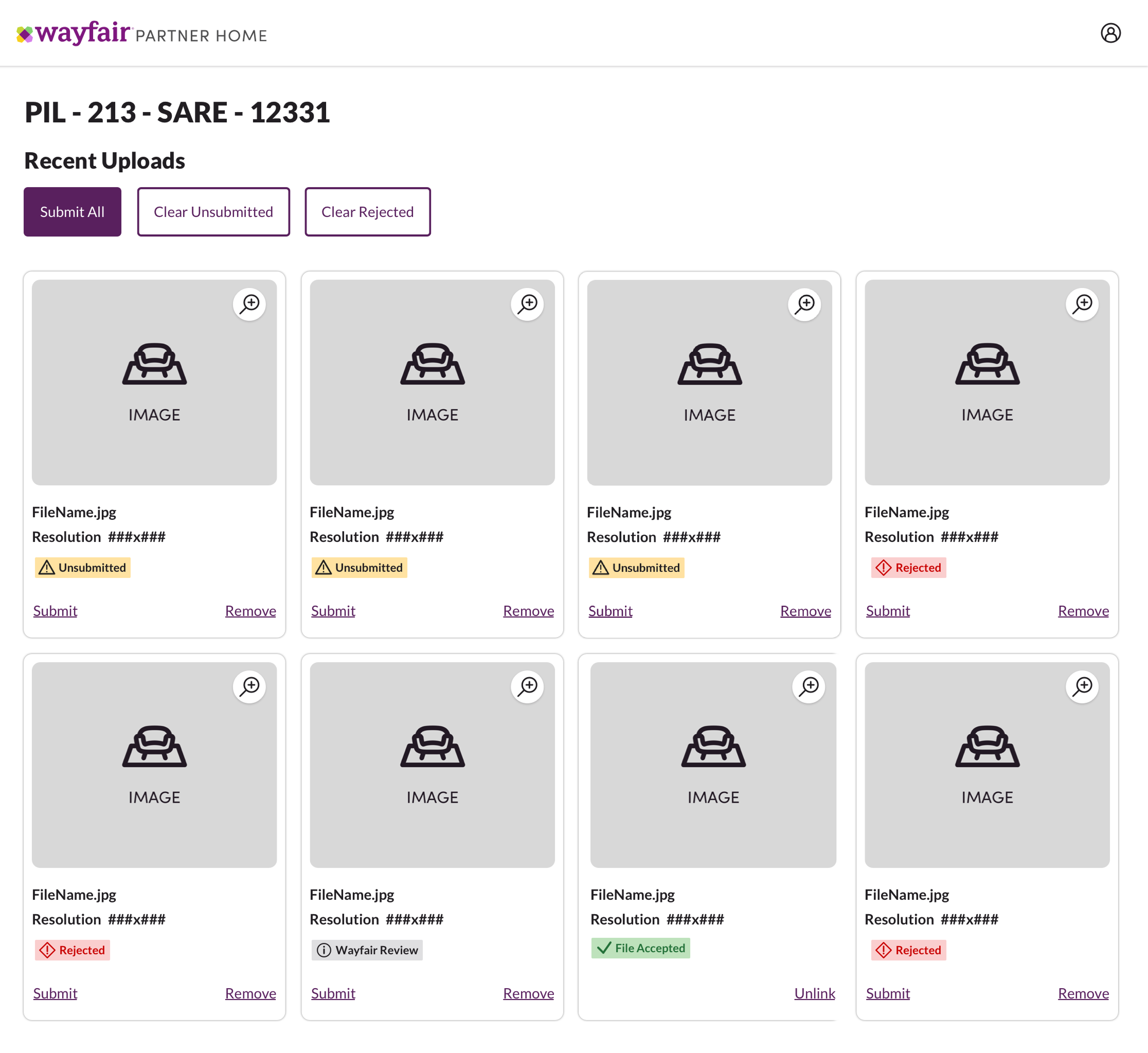
Suppliers rely on status information to understand where a product or process stands so they can prioritize work and make informed decisions. However, across the supplier experience, status indicators were presented inconsistently, using different visual treatments and language to communicate the same level of urgency. For example, similar states appeared as yellow badges in one place and green links with icons in another, while terms like “Needs Attention,” “Warning,” and “Violations” were used interchangeably to describe urgent states. This inconsistency created confusion and increased cognitive load for suppliers. The goal was to create a single, flexible status component that product teams could use consistently across cards, tables, drawers, and pages, while standardizing language to clearly and reliably communicate status meaning.
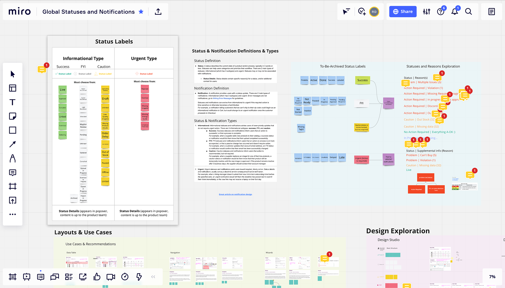
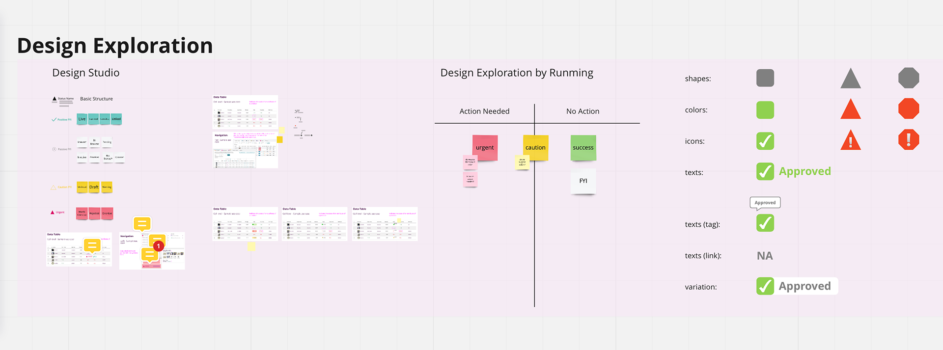
The assumption we heard from other Partner Home designers was that we needed to tone down the status visuals because there were so many on each page (this turned out to be an incorrect assumption based on supplier testing!).
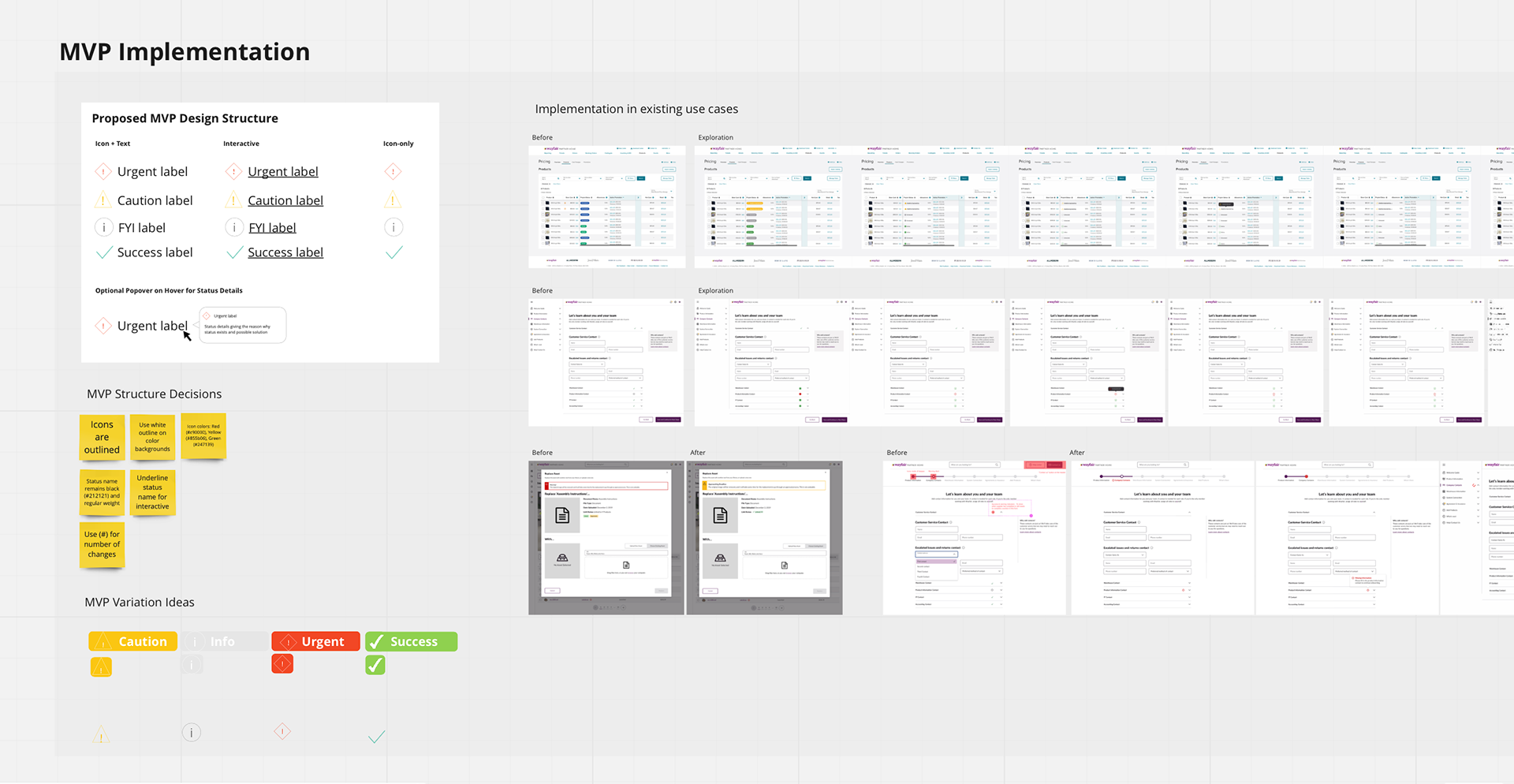
Dan and I conducted 7 user tests with suppliers to understand which status indicator helped them most:
• Imagine that you uploaded images to be associated with a product on site. What do you see on this page?
• What actions would you take on this page?
• Anything else?
• Imagine that you uploaded images to be associated with a product on site. What do you see on this page?
• What actions would you take on this page?
• Anything else?
The results were:
• Toned-down visuals (0 out of 7 suppliers chose this one)
• Badges with no icon (3 out of 7 suppliers chose this one because it popped and was much easier to recognize)
• Badges with an icon (3 out of 7 suppliers chose this one because the icons can help those who speak English as a second language)
• Toned-down visuals (0 out of 7 suppliers chose this one)
• Badges with no icon (3 out of 7 suppliers chose this one because it popped and was much easier to recognize)
• Badges with an icon (3 out of 7 suppliers chose this one because the icons can help those who speak English as a second language)
Suppliers also mentioned that they expected to get more information when hovering on the badge.
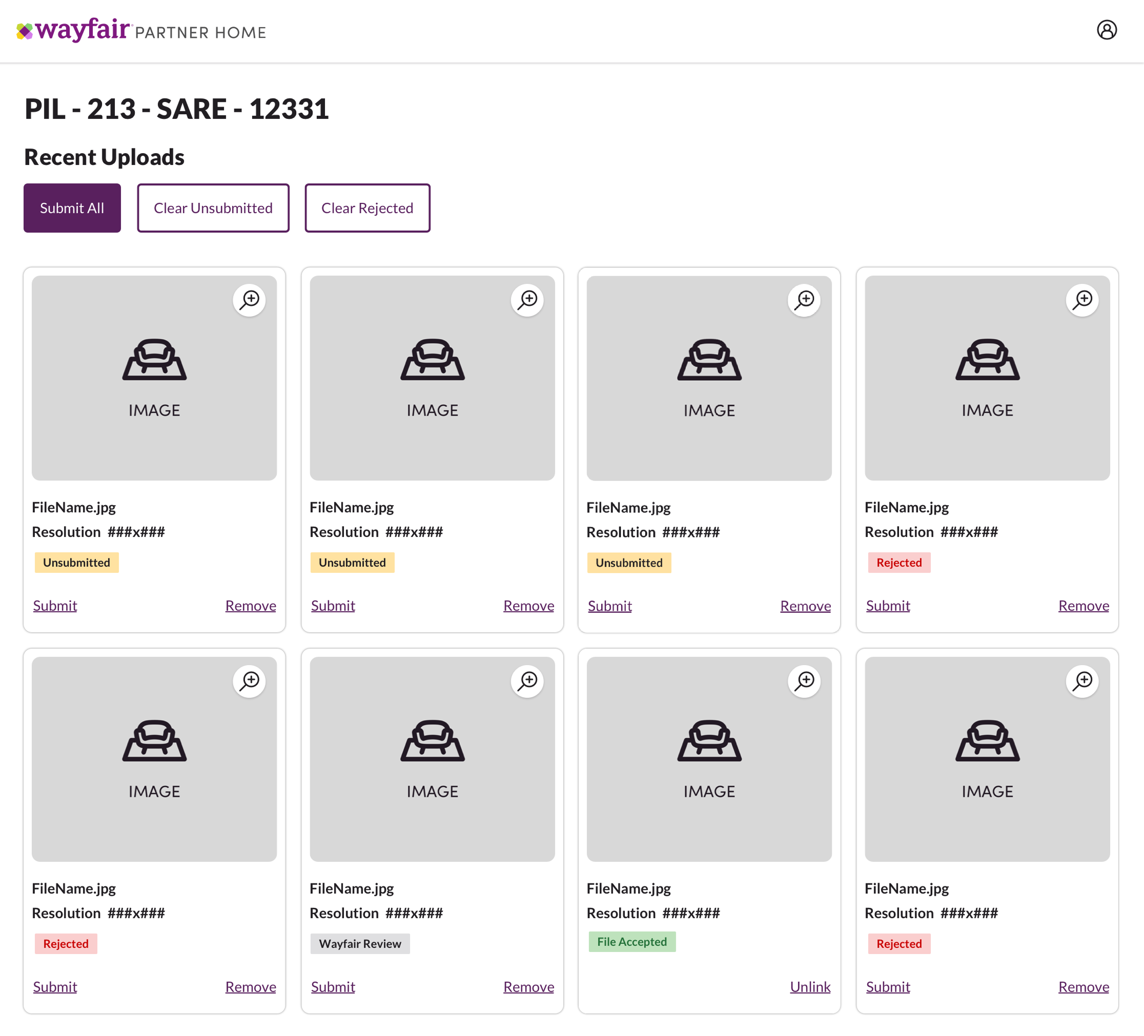
Outcome:
Proposals submitted to the Homebase design system team:
• Add icons to badges to improve accessibility for those who speak English as a second language or have color blindness
• Allow a popover to appear when interacting with a badge
• Introduce a new list of global status labels to choose from
Proposals submitted to the Homebase design system team:
• Add icons to badges to improve accessibility for those who speak English as a second language or have color blindness
• Allow a popover to appear when interacting with a badge
• Introduce a new list of global status labels to choose from
On-Site Survey Design
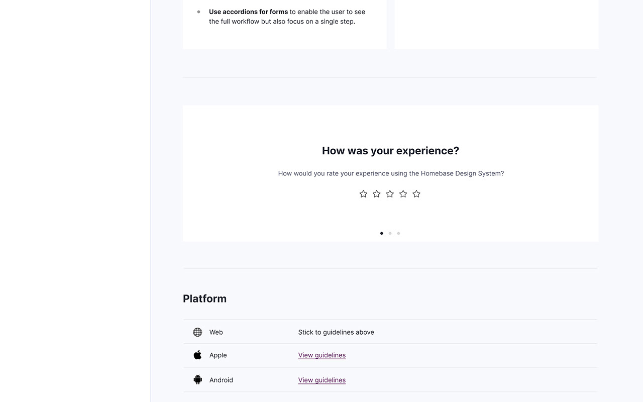
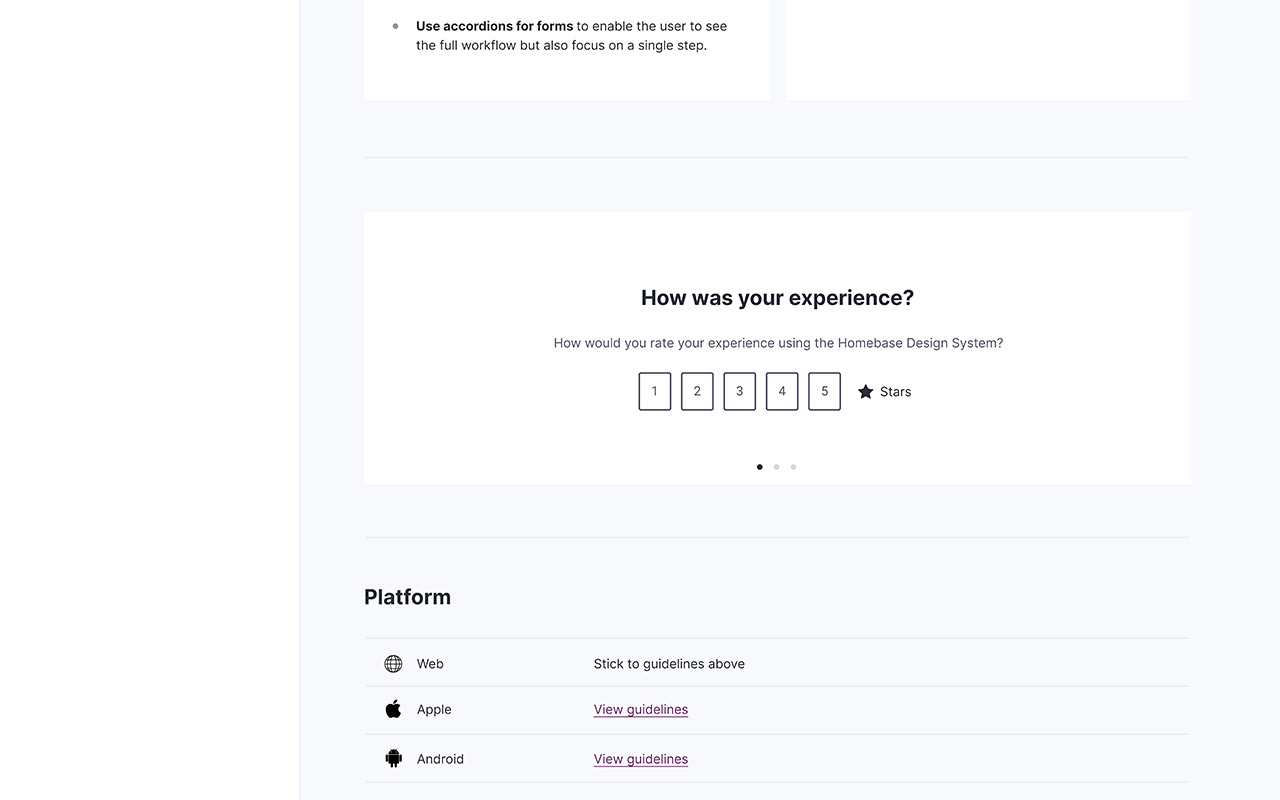
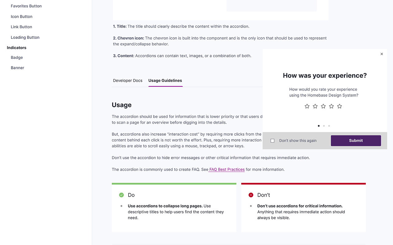
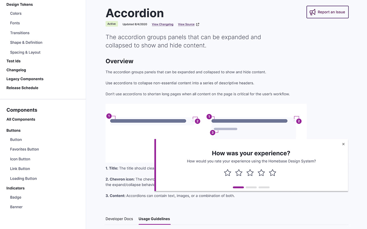
The Homebase team wanted a low-friction way for users to share feedback directly within the design system site. Since the site is used primarily as a working reference, feedback needed to be quick, unobtrusive, and consistent with the system’s patterns. The goal was to design an on-site survey component based on CSAT guidelines that could reliably measure user satisfaction while integrating seamlessly into the documentation experience.
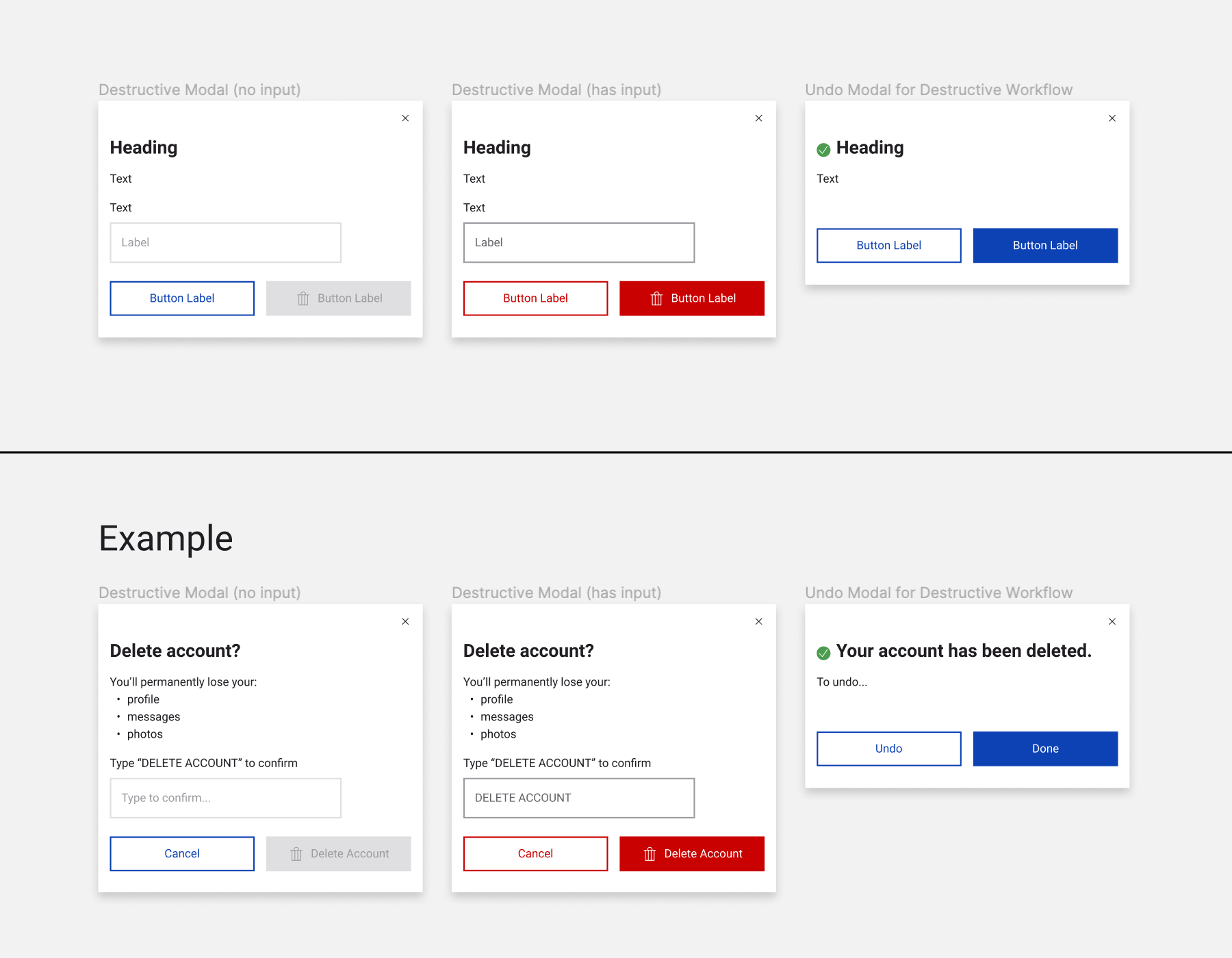
Destructive Action Proposal
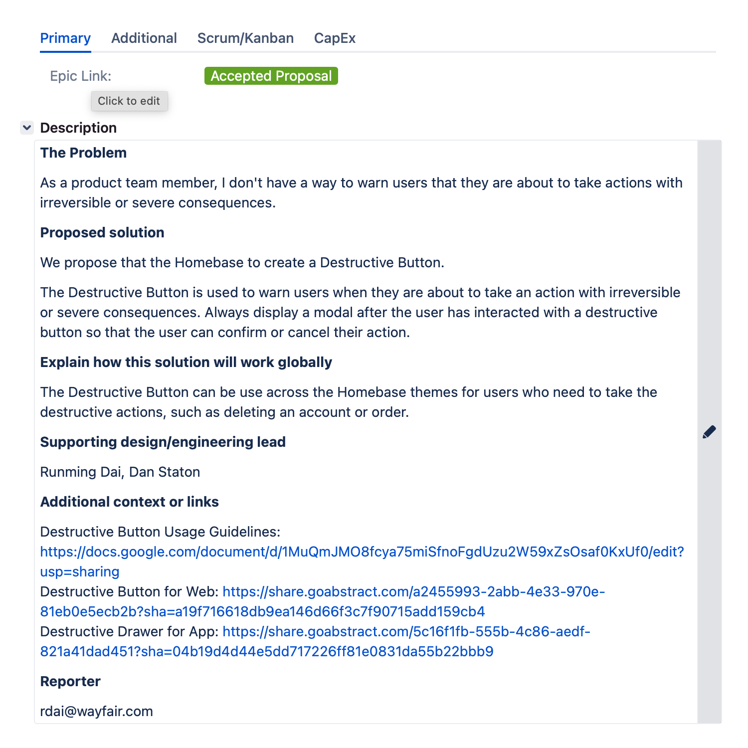
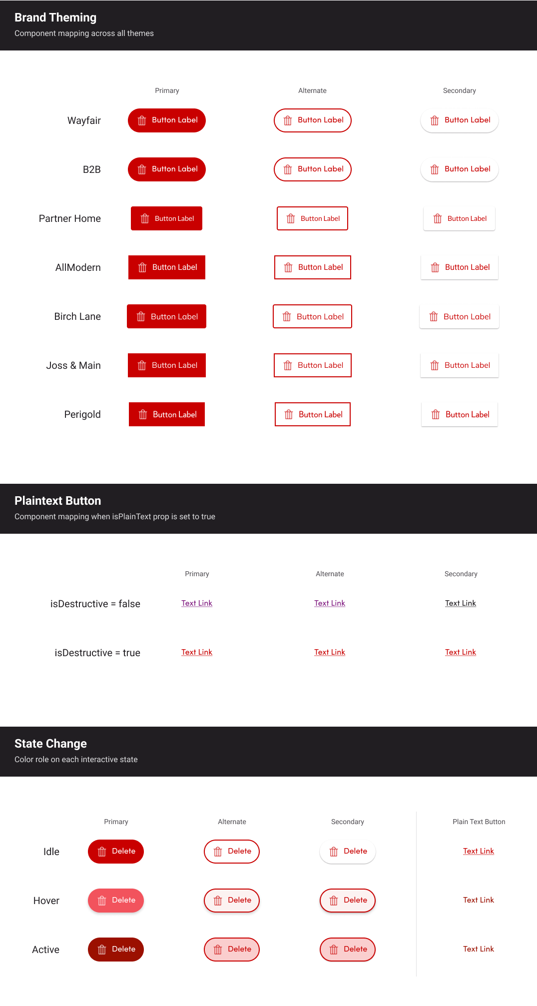
Product teams did not have a consistent way to warn users before they took actions with irreversible or severe consequences, such as deleting an account or canceling an order. To address this, we introduced a destructive button pattern within the Homebase Design System. The destructive button is used specifically for high-risk actions and is always paired with a confirmation modal, giving users a clear moment to review, confirm, or cancel their decision. Designed to work across all Homebase themes, this pattern establishes a shared, reliable approach to handling destructive actions while maintaining clarity, safety, and consistency at scale.
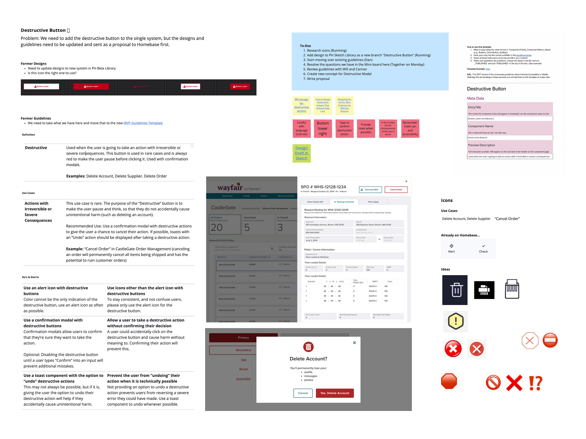
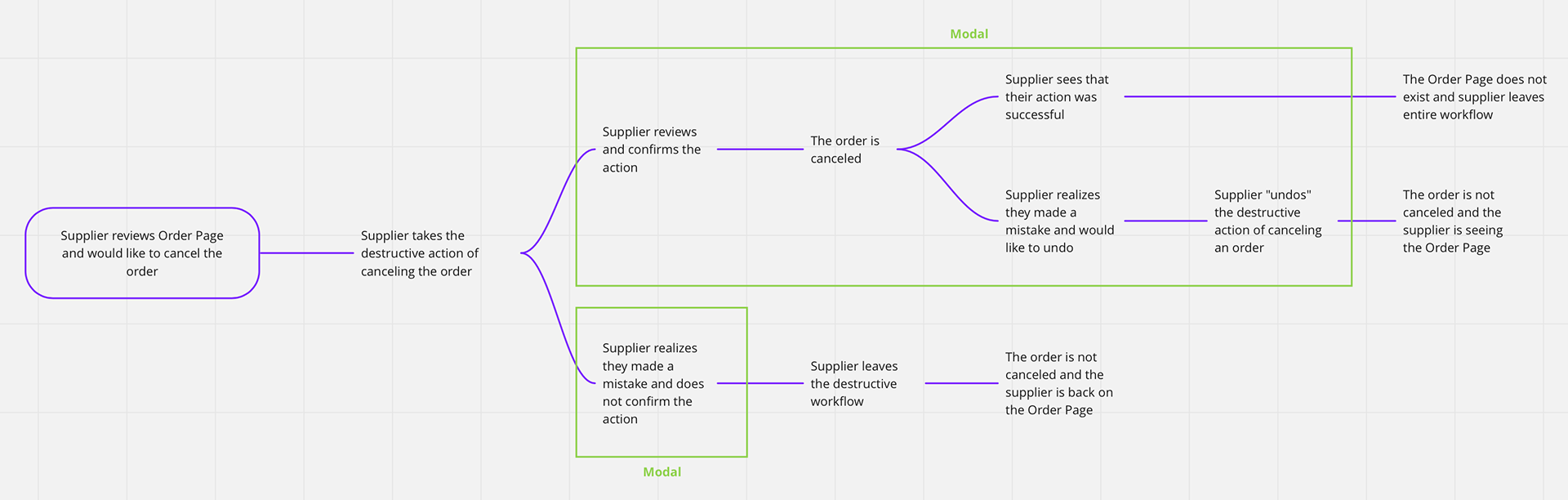
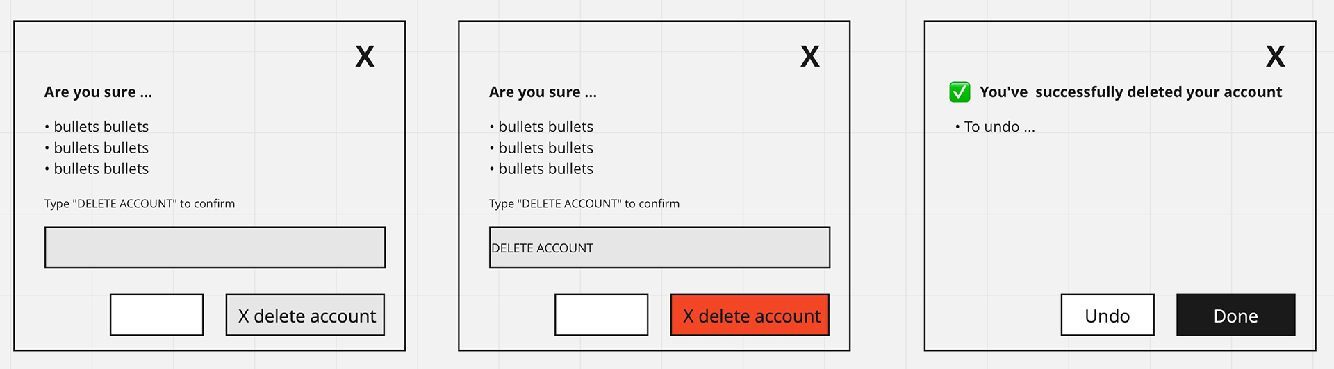
While the Destructive Button pattern helps warn users before taking high-risk actions, product teams still lacked a consistent way to support recovery after an action was taken. To address this, we introduced an undo pattern within the Homebase Design System that allows users to reverse destructive actions through a modal. The modal persists for as long as the action remains undoable, and can be dismissed by the user or automatically cleared when the user navigates away. Designed to work across all Homebase themes, this pattern complements the destructive button by providing a clear, reliable safety net for actions such as deleting an account or canceling an order.
The Homebase Blog Design
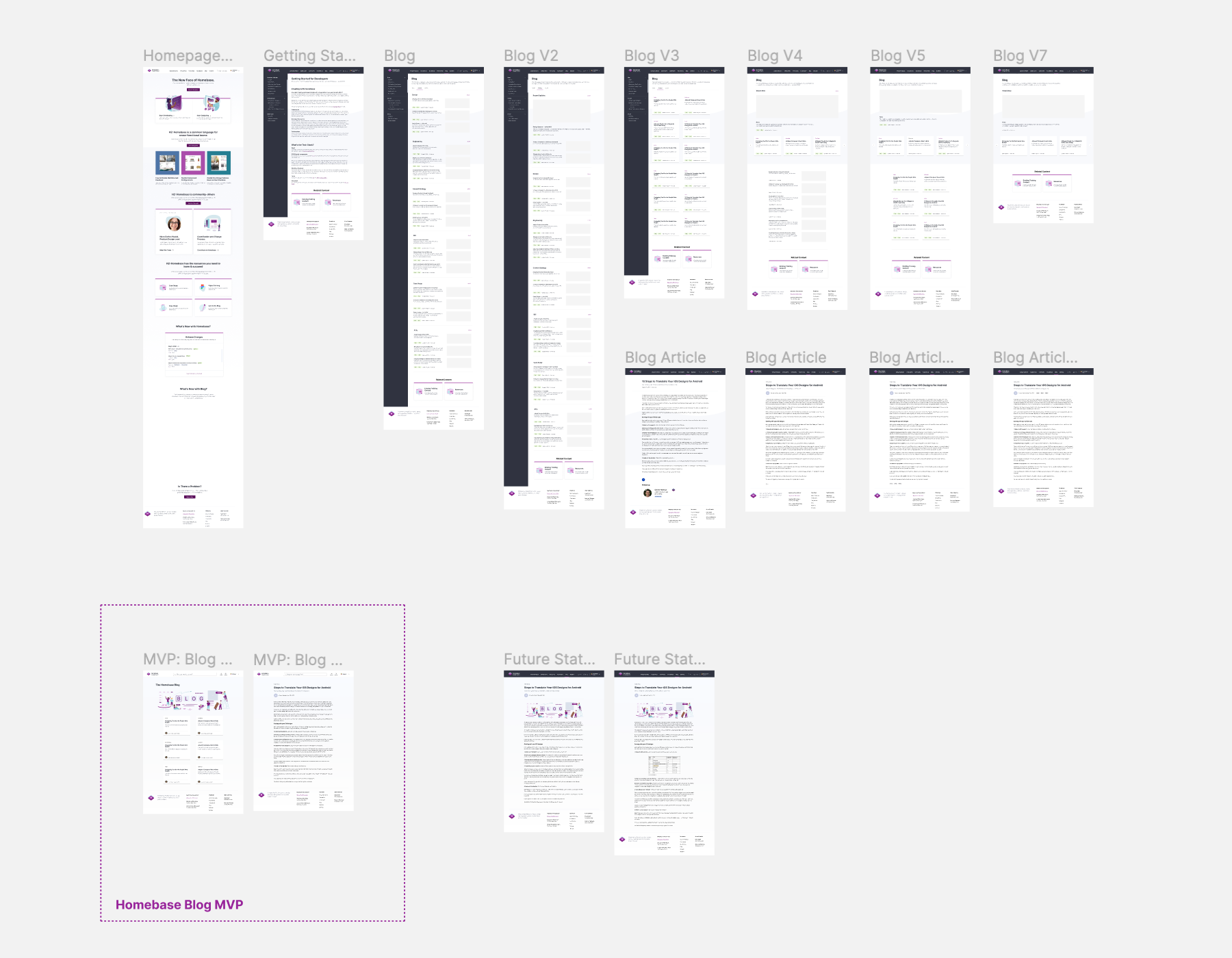
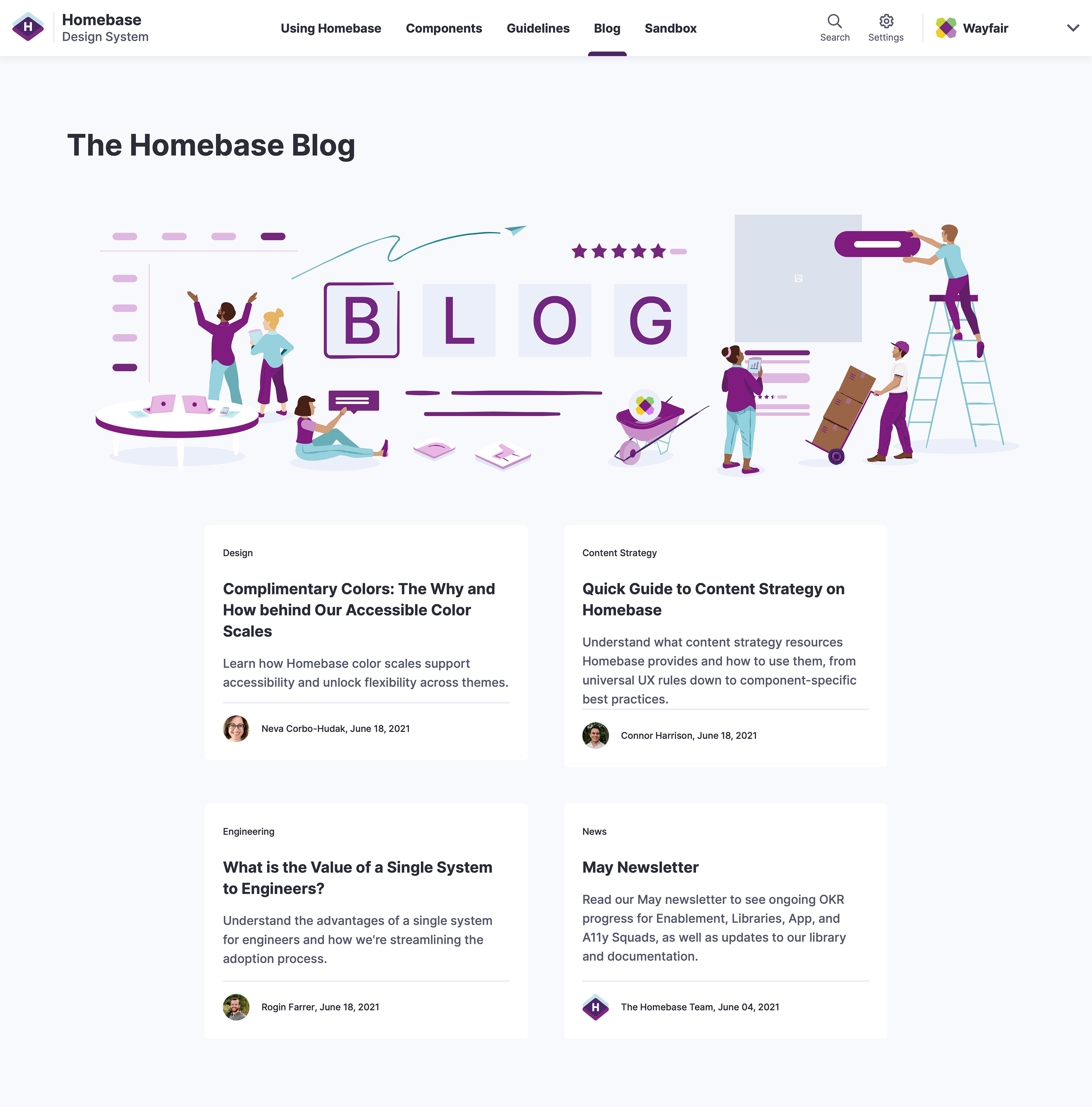
As Homebase continued to evolve its value proposition, the team identified a need for a dedicated Blog to centralize updates and ongoing content. The goal was to create a scalable Blog experience, including both a landing page and individual article pages, that could surface news, articles, events, and training resources. Built as part of the broader Homebase system, the Blog was designed to be easy to maintain, consistent with existing patterns, and flexible enough to scale as content grows.
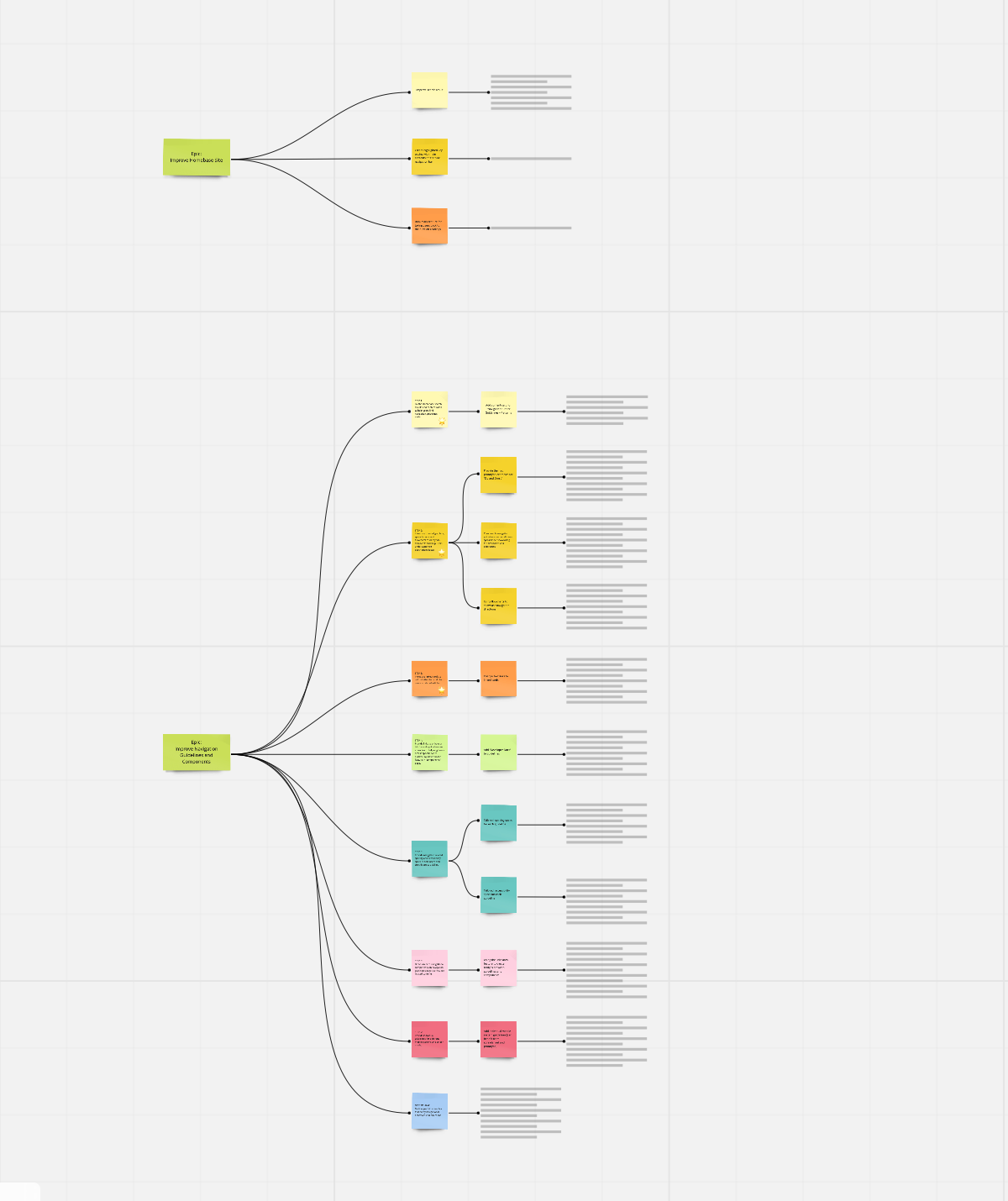
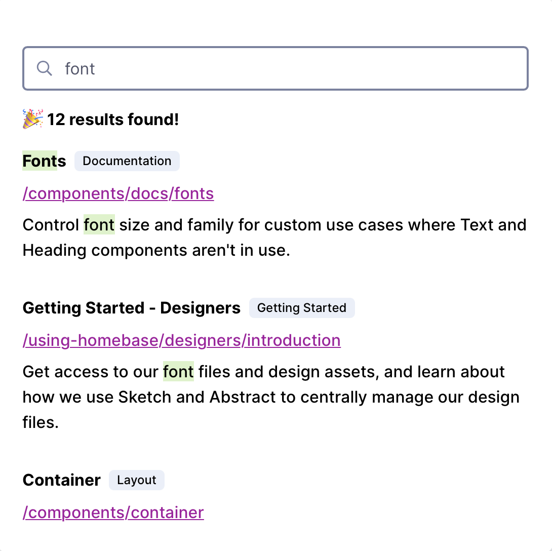
Navigation Audit for Homebase Design System
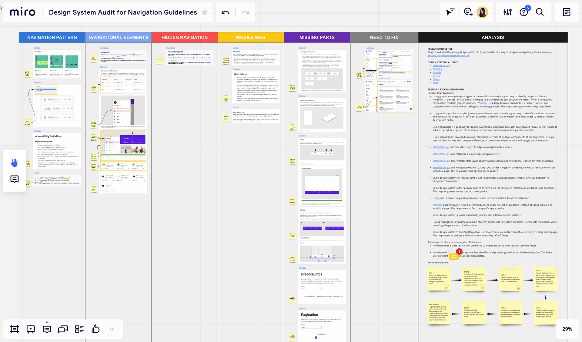
To reduce friction in navigating the Homebase Design System site, the team set out to better understand how users move through system documentation. The goal was to analyze and learn from existing design systems, identifying navigation patterns and structures that effectively support discovery and wayfinding.
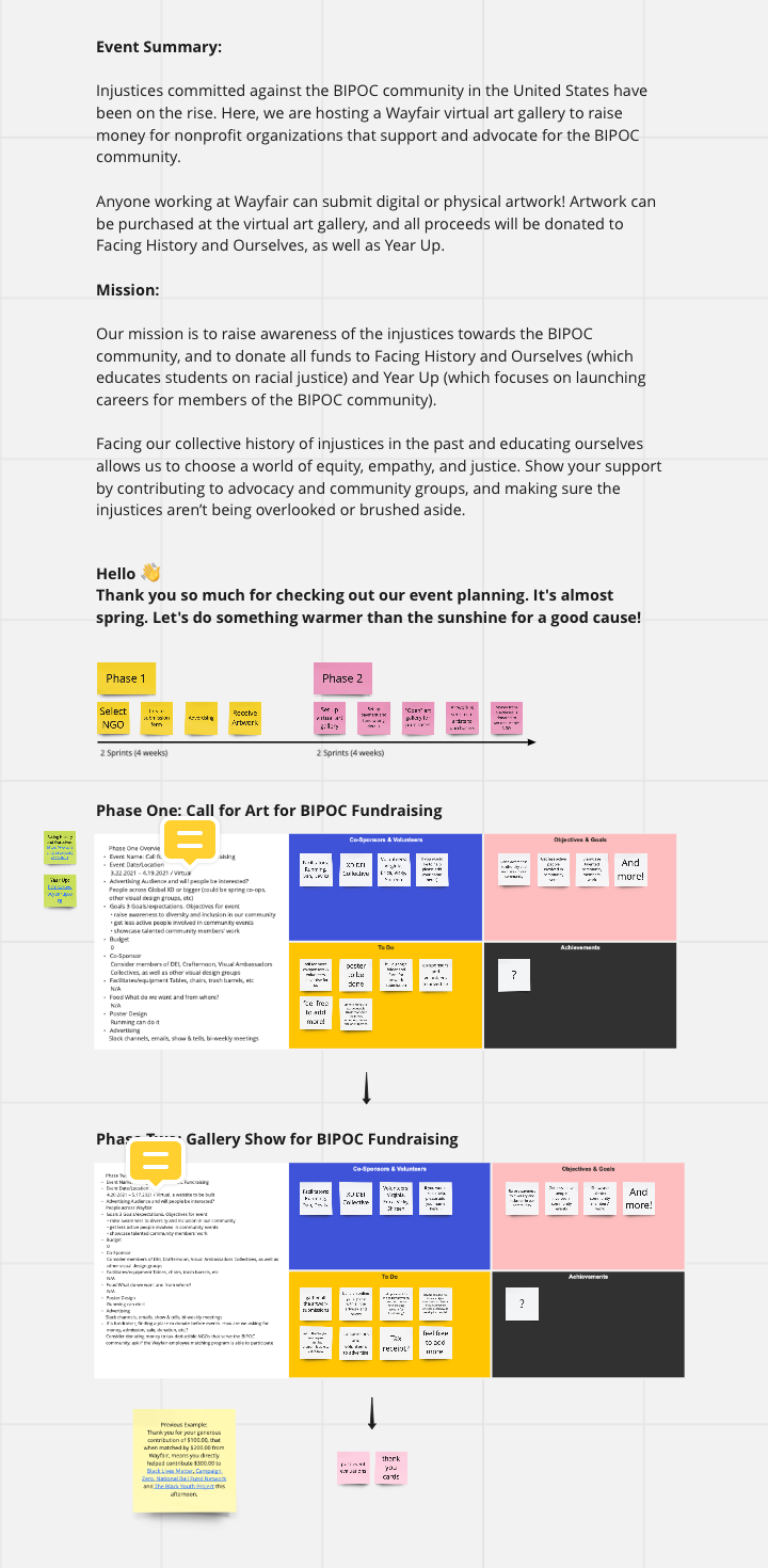
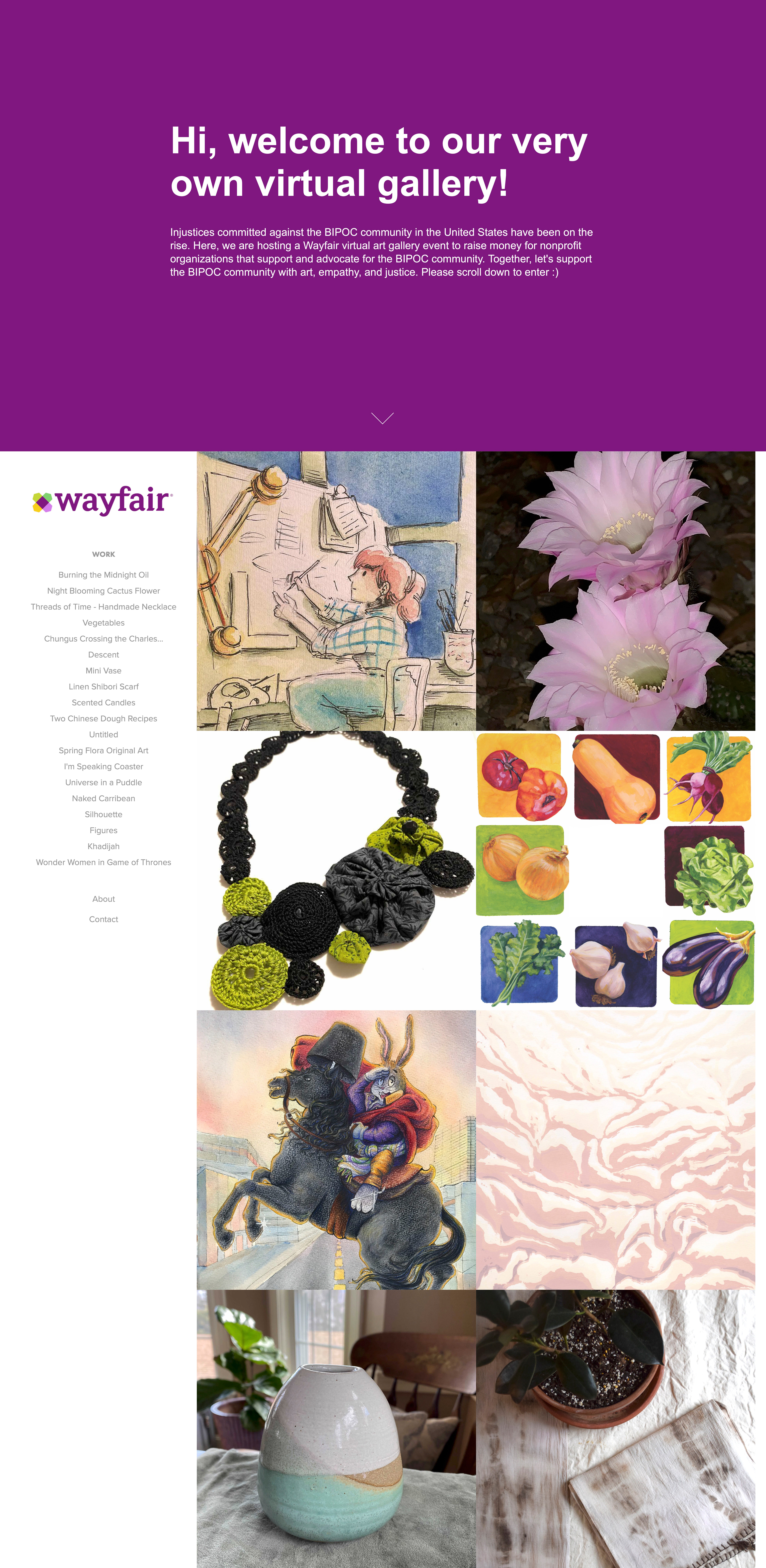
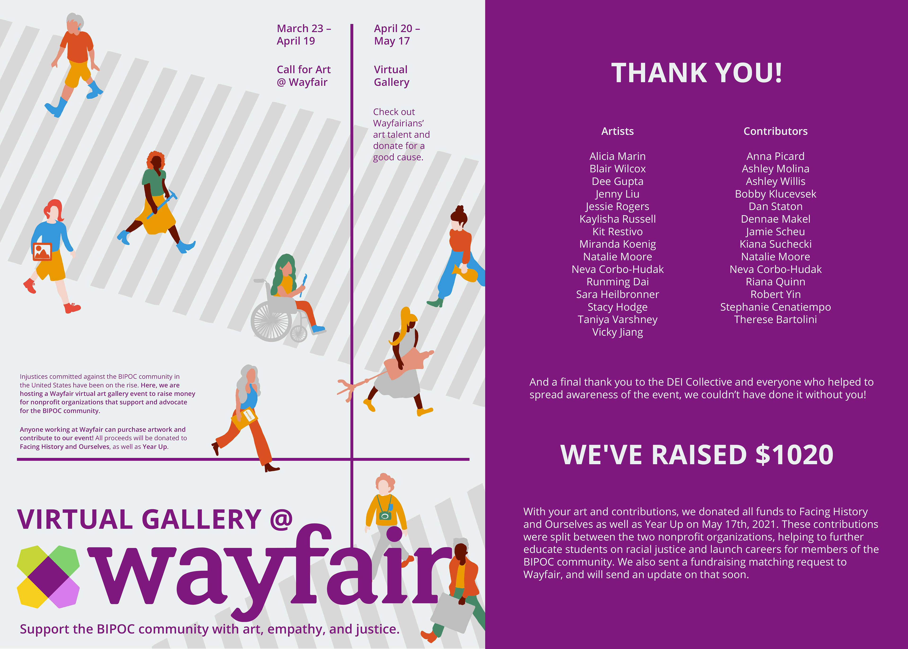
Virtual Gallery @Wayfair
As injustices against the BIPOC community continued to rise across the United States, the Wayfair team felt a responsibility to create space for awareness and action in a way that felt thoughtful and community-driven. I initiated and organized a virtual art gallery at Wayfair as a way to center voices, stories, and creative expression, using art as a a catalyst for reflection and conversation. The event was designed to have tangible impact, with all funds raised donated to Facing History and Ourselves, which focuses on racial justice education; and Year Up, which supports career pathways for members of the BIPOC community.