Block Kit Strategy
Background:
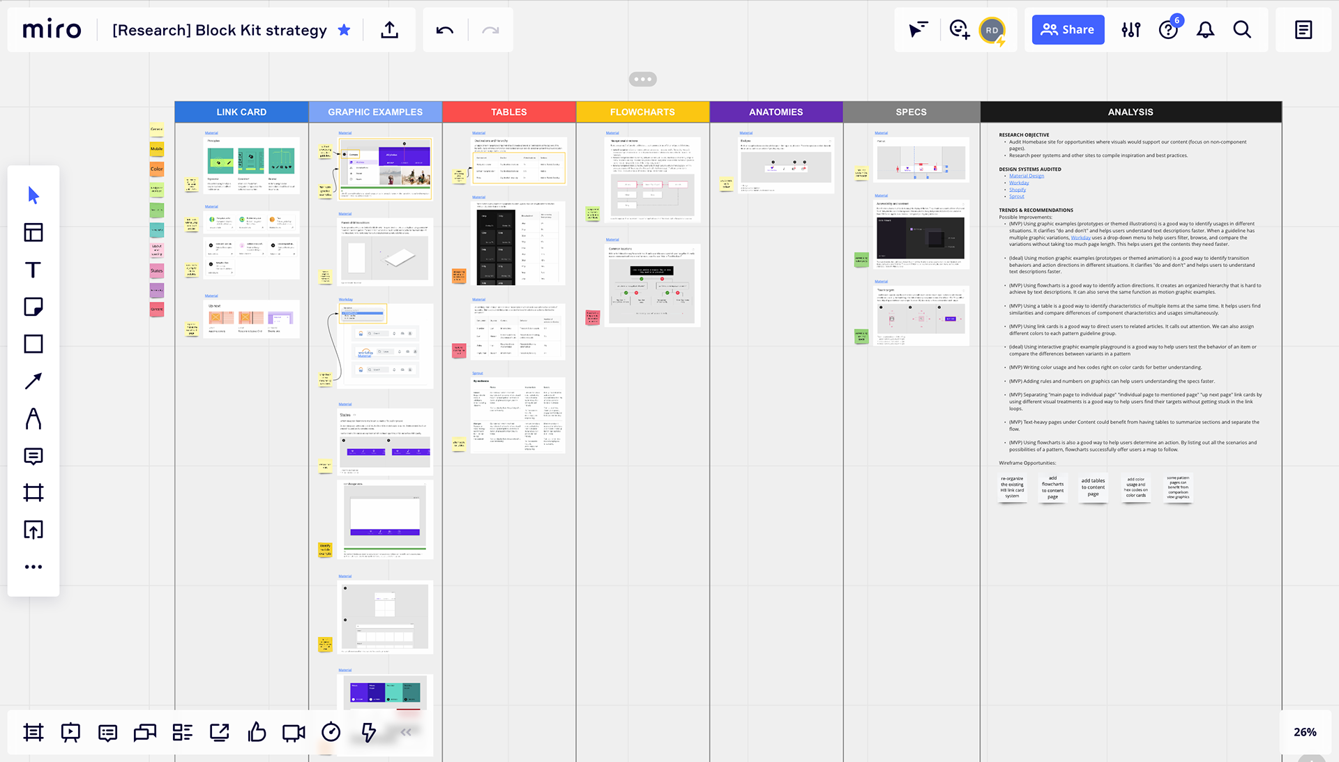
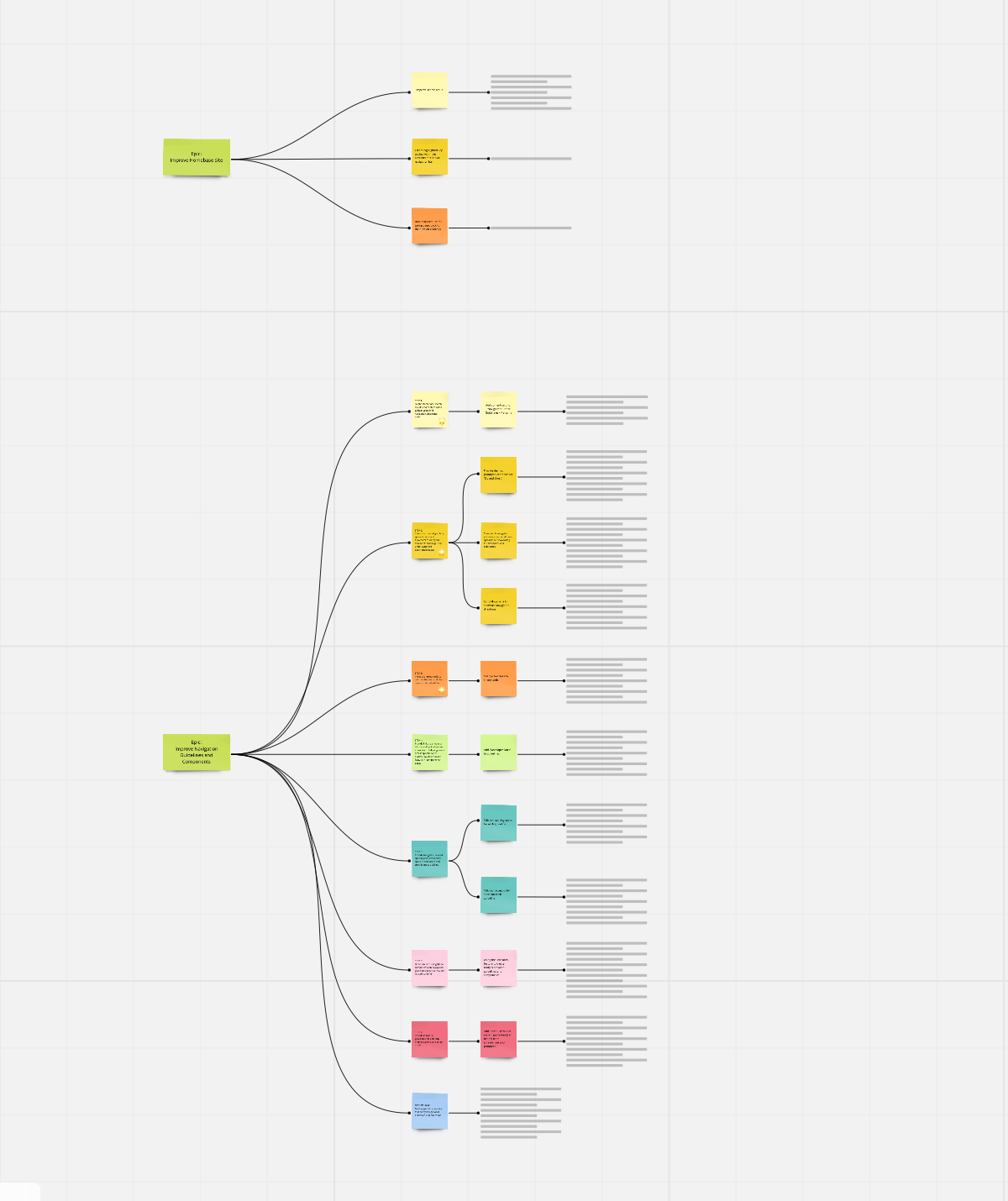
The Block Kit is a non-branded library used to build images for the Homebase Design System website that work across themes (e.g., Wayfair, AllModern, Partner Home). All images on the Homebase site should be live demos or Block Kit-built. The Homebase Design System will be rebuilding the Block Kit in Figma, which is a great opportunity to reevaluate the strategy for using imagery on the site and build a kit that reflects that.
The Block Kit is a non-branded library used to build images for the Homebase Design System website that work across themes (e.g., Wayfair, AllModern, Partner Home). All images on the Homebase site should be live demos or Block Kit-built. The Homebase Design System will be rebuilding the Block Kit in Figma, which is a great opportunity to reevaluate the strategy for using imagery on the site and build a kit that reflects that.
Goal:
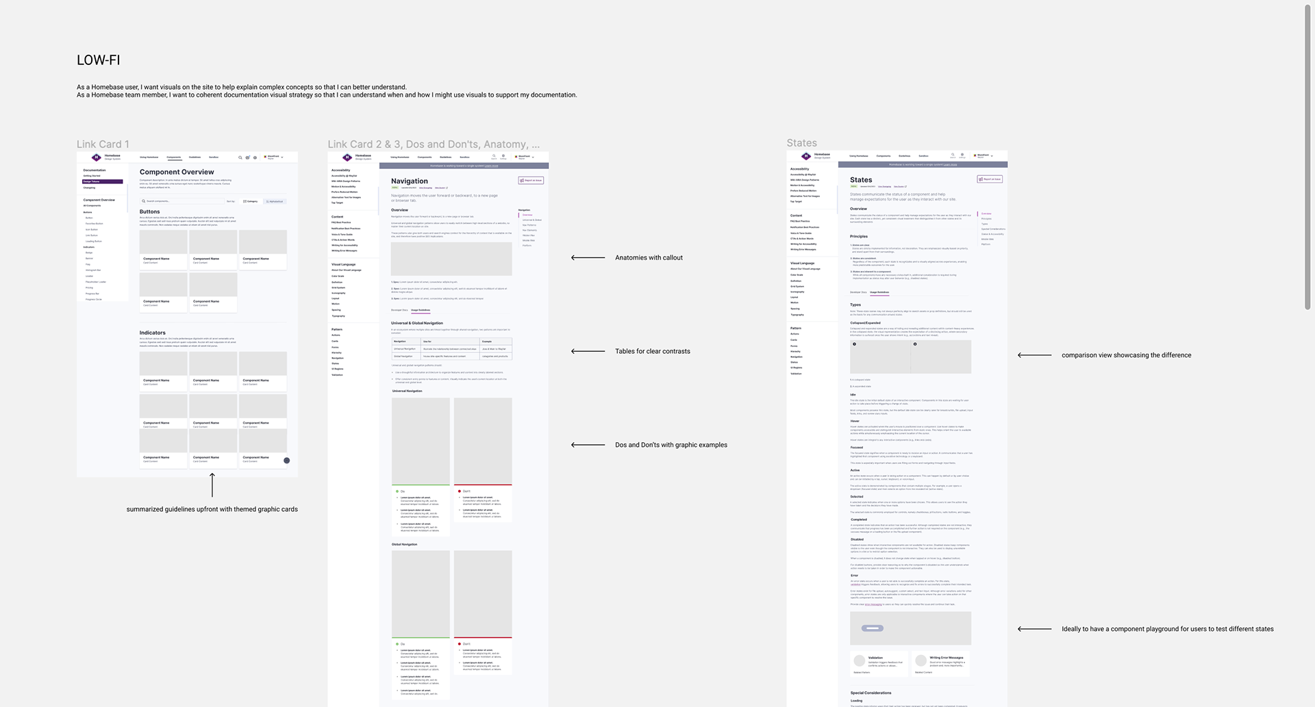
As a Homebase user, I want visuals on the site to help explain complex concepts so that I can better understand them. As a Homebase team member, I want to coherent documentation visual strategy so that I can understand when and how I might use visuals to support my documentation.


Status Indicator Design & User Testing
Background:
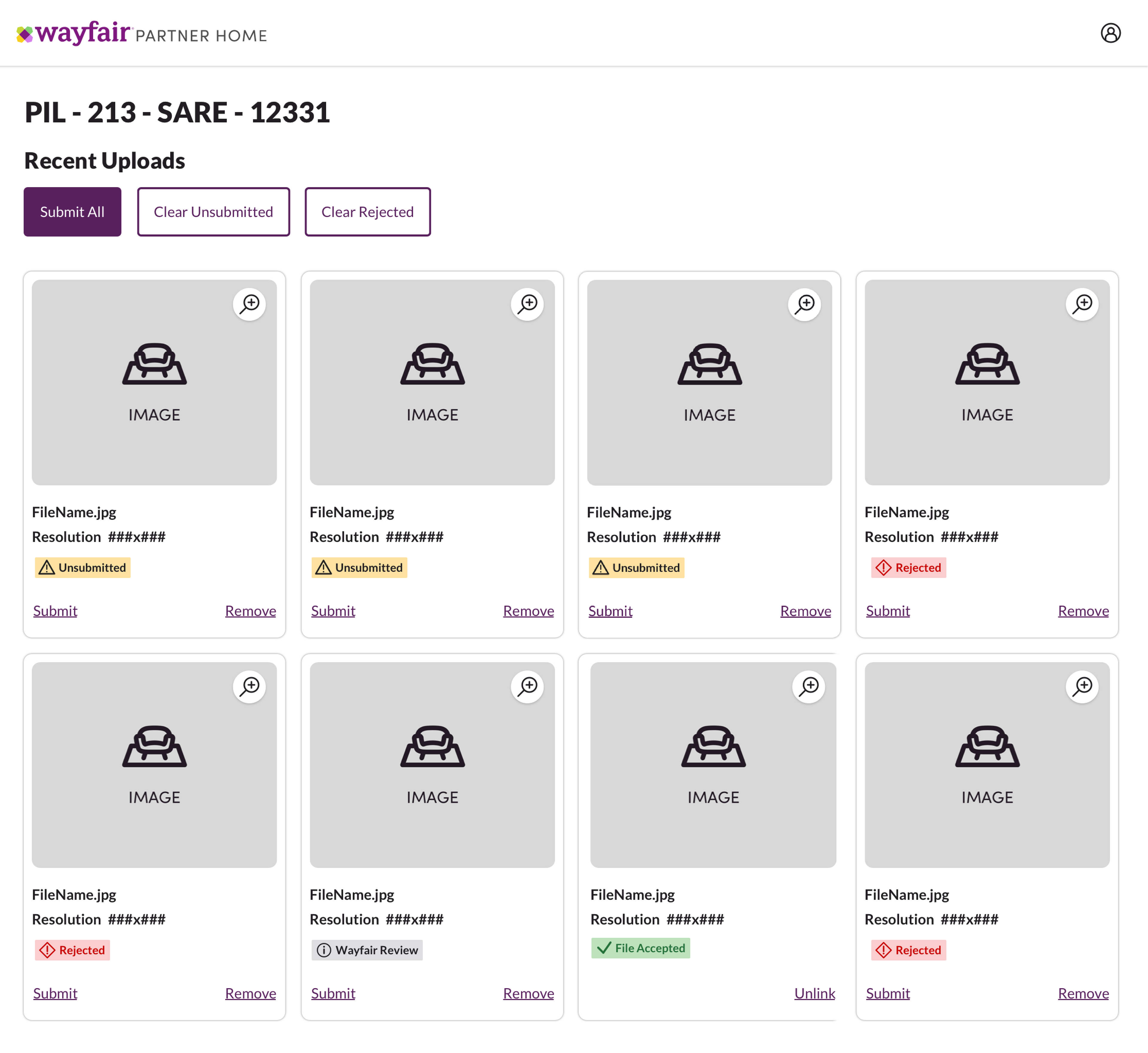
Suppliers need to be informed on the status of a product (ie. adding a new product to their catalog), or a process (ie. shipping), so that they can prioritize their actions and make informed decisions. But the current statuses are displayed inconsistently across the supplier experience:
• Inconsistent visuals (notice "Opportunities" appears in a yellow badge in one screenshot, but appears as a green link with a checkmark in another screenshot)
• Inconsistent language (notice "Needs Attention," "Warning," and "Violations" all are communicating an urgent-level status but not using the same language)
Goal:
Product design teams could use a single component for displaying statuses across cards, tables, drawers, and pages in their experiences while using the same language.
Product design teams could use a single component for displaying statuses across cards, tables, drawers, and pages in their experiences while using the same language.
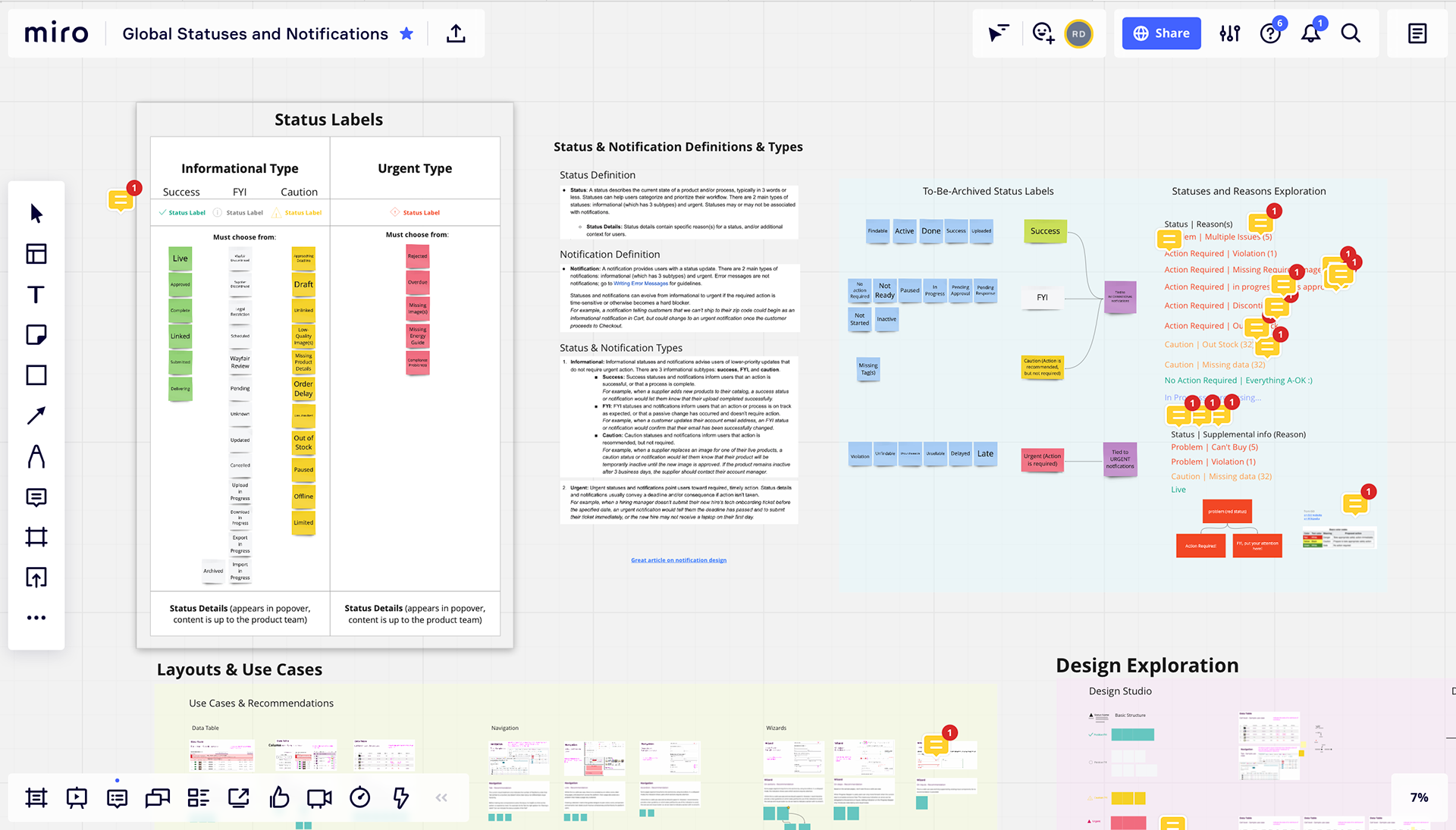
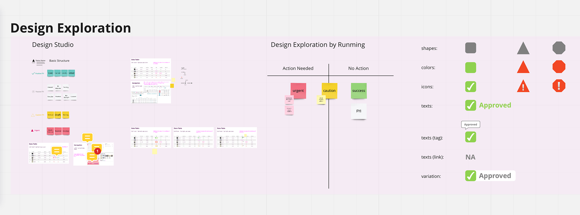
The assumption we heard from other Partner Home designers was that we needed to tone down the status visuals because there were so many on each page (this turned out to be an incorrect assumption based on supplier testing!).
Dan and I conducted 7 user tests with suppliers to understand which status indicator helped them most:
• Imagine that you uploaded images to be associated with a product on site. What do you see on this page?
• What actions would you take on this page?
• Anything else?
• Imagine that you uploaded images to be associated with a product on site. What do you see on this page?
• What actions would you take on this page?
• Anything else?
The results were:
• Toned-down visuals (0 out of 7 suppliers chose this one)
• Badges with no icon (3 out of 7 suppliers chose this one because it popped and was much easier to recognize)
• Badges with an icon (3 out of 7 suppliers chose this one because the icons can help those who speak English as a second language)
Suppliers also mentioned that they expected to get more information when hovering on the badge.

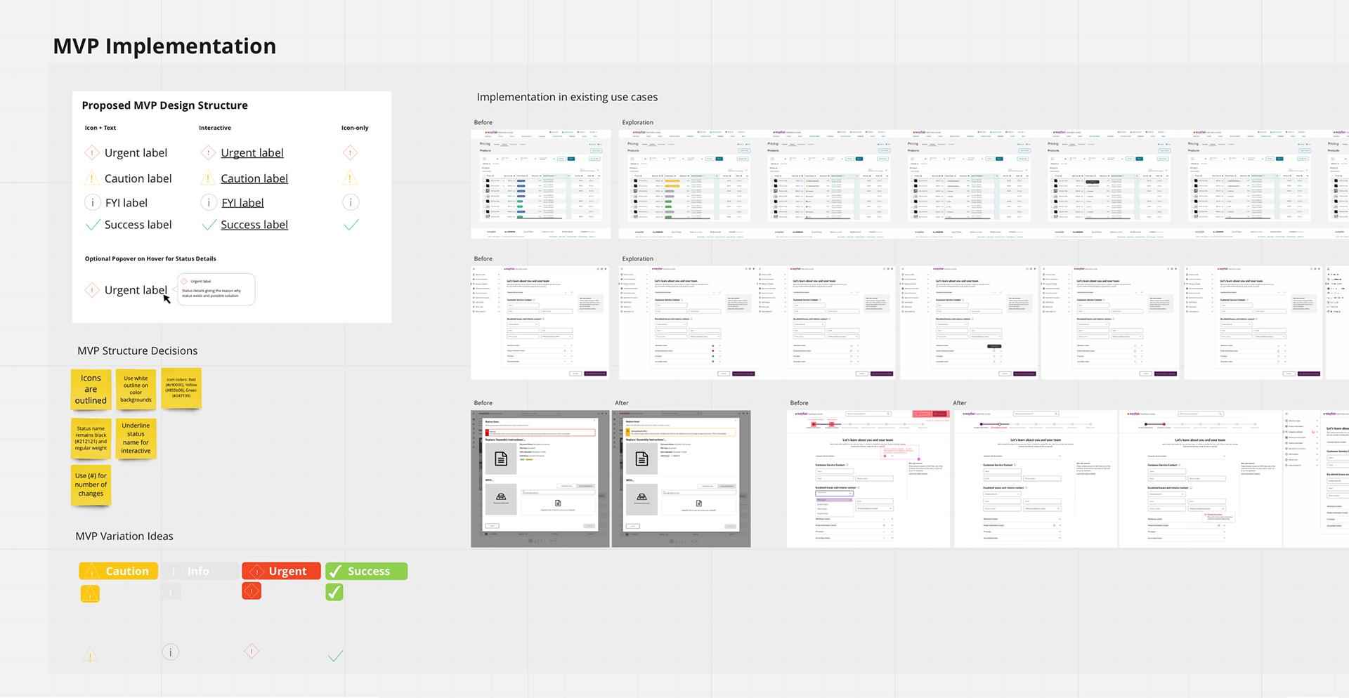
Outcome:
Proposals submitted to the Homebase design system team:
• Add icons to badges to improve accessibility for those who speak English as a second language or have color blindness
• Allow a popover to appear when interacting with a badge
• Introduce a new list of global status labels to choose from
Proposals submitted to the Homebase design system team:
• Add icons to badges to improve accessibility for those who speak English as a second language or have color blindness
• Allow a popover to appear when interacting with a badge
• Introduce a new list of global status labels to choose from
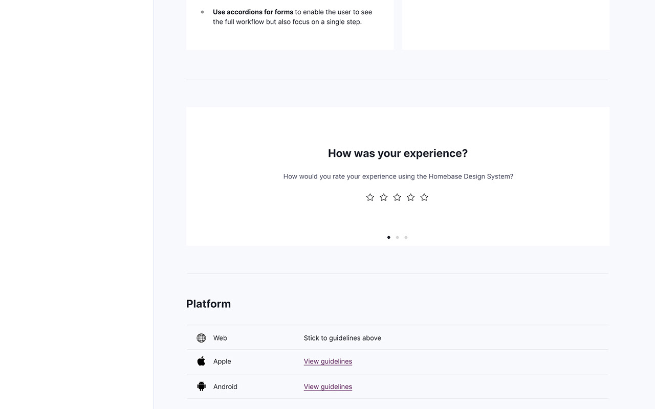
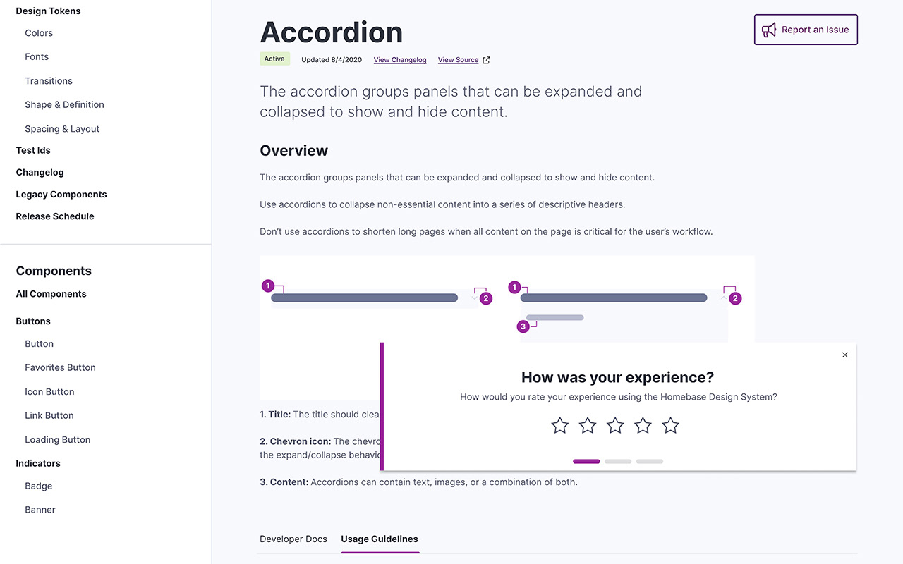
On-Site Survey Design
Background:
As a Homebase team, we want users to be able to submit feedback through the Homebase Design System site with as little friction as possible.
As a Homebase team, we want users to be able to submit feedback through the Homebase Design System site with as little friction as possible.
Goal:
Create design for the on-site survey form based on the CSAT survey guidelines, which help measure user satisfaction.
Create design for the on-site survey form based on the CSAT survey guidelines, which help measure user satisfaction.


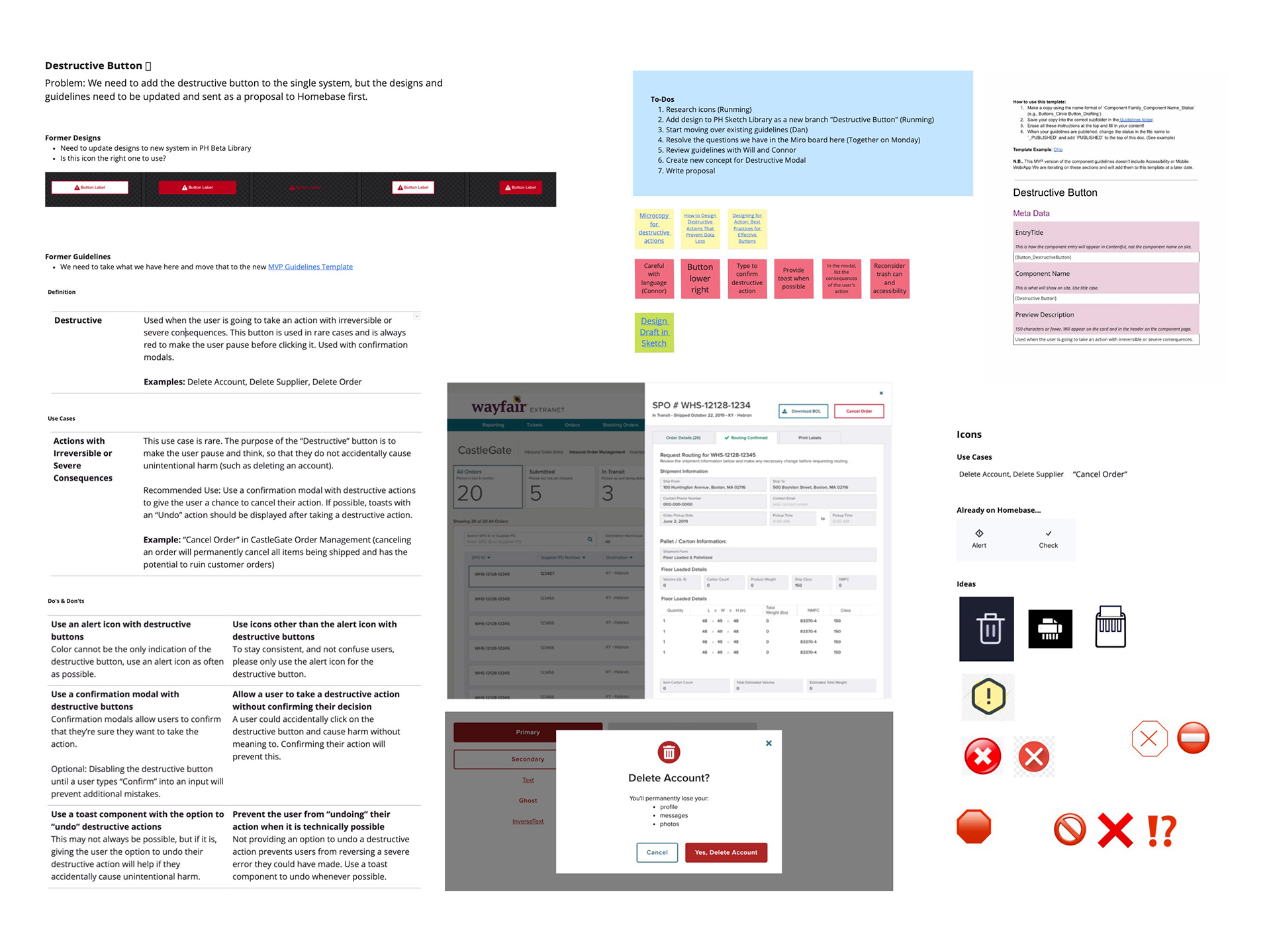
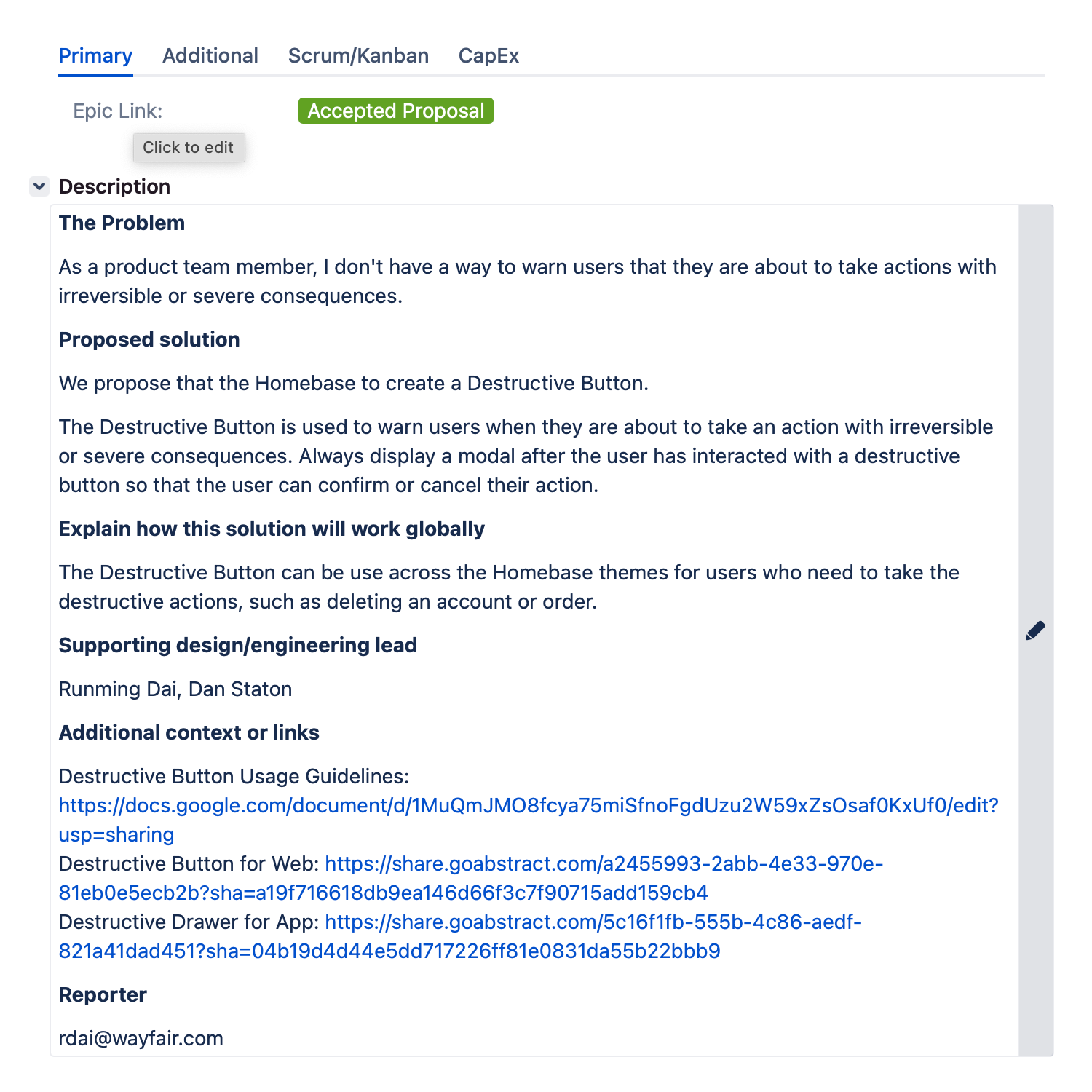
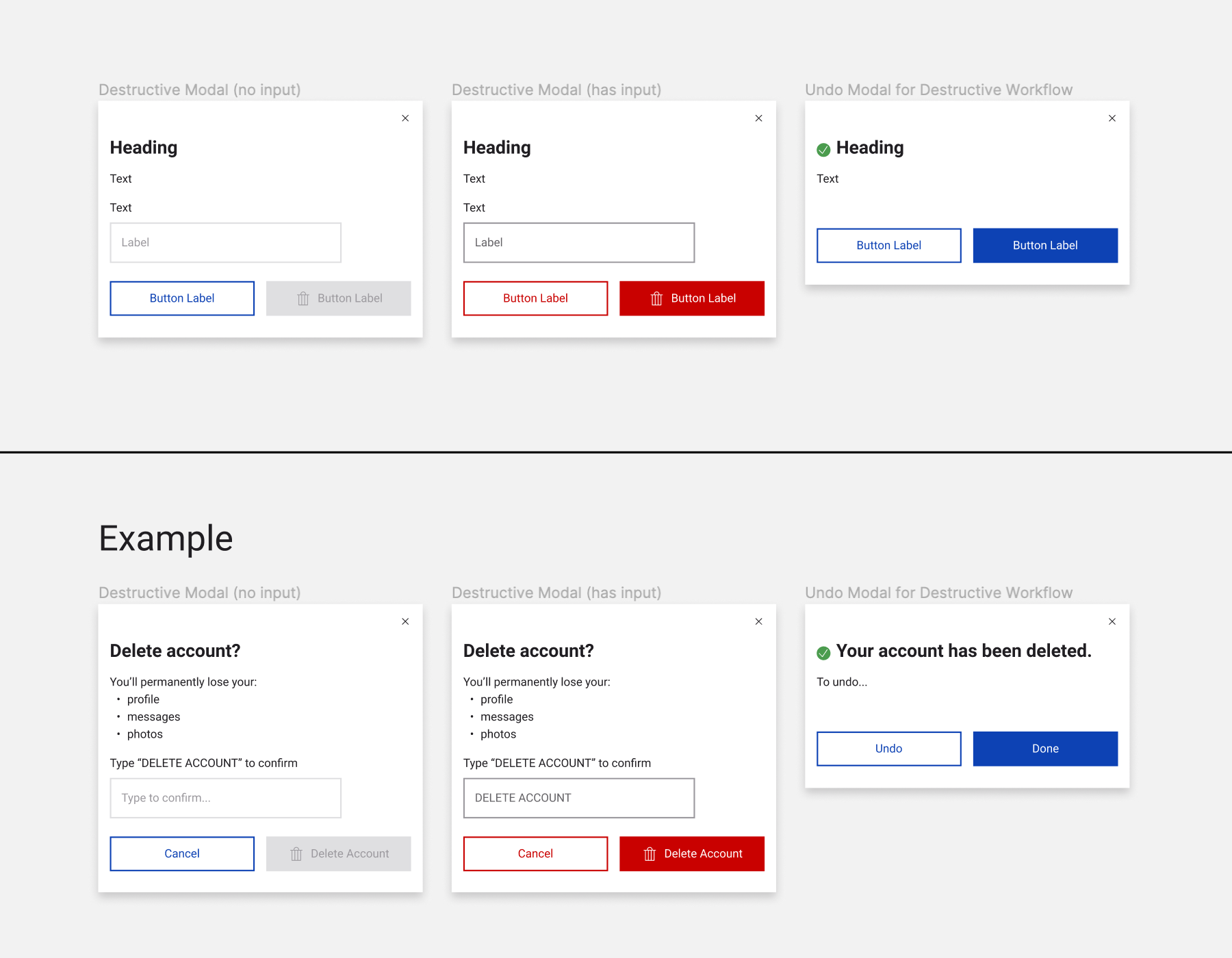
Destructive action proposal
The problem:
As a product team member, I don't have a way to warn users that they are about to take actions with irreversible or severe consequences.
As a product team member, I don't have a way to warn users that they are about to take actions with irreversible or severe consequences.
Proposed solution:
We propose that the Homebase to create a Destructive Button.
The Destructive Button is used to warn users when they are about to take an action with irreversible or severe consequences. Always display a modal after the user has interacted with a destructive button so that the user can confirm or cancel their action.
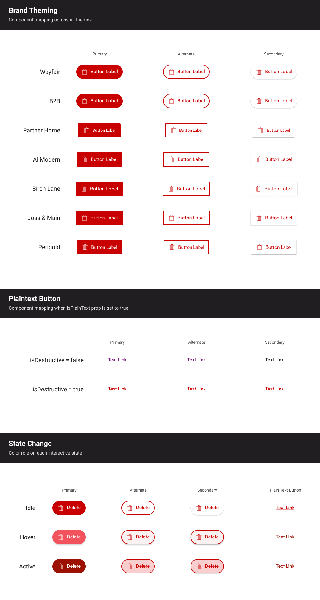
Explain how this solution will work globally:
The Destructive Button can be use across the Homebase themes for users who need to take the destructive actions, such as deleting an account or canceling an order.
The Destructive Button can be use across the Homebase themes for users who need to take the destructive actions, such as deleting an account or canceling an order.
Supporting design/engineering lead:
Runming Dai, Dan Staton
Runming Dai, Dan Staton
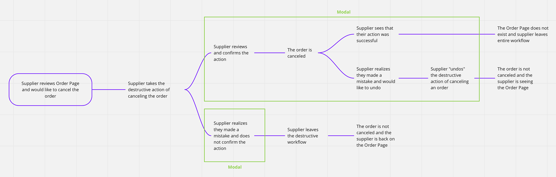
The problem:
As a product team member, I don't have a way to allow the user to undo their destructive action.
As a product team member, I don't have a way to allow the user to undo their destructive action.
Proposed solution:
We propose that the Homebase to allow the user to undo their destructive action through a modal, in case they made a mistake.
The modal can persist as long as the action is undoable. Otherwise, the modal can be dismissed by the user, or will disappear when the user leaves the page.
We propose that the Homebase to allow the user to undo their destructive action through a modal, in case they made a mistake.
The modal can persist as long as the action is undoable. Otherwise, the modal can be dismissed by the user, or will disappear when the user leaves the page.
Explain how this solution will work globally:
The undo feature in modal can be use across the Homebase themes to allow users to undo their destructive action, in case they made a mistake, such as deleting an account or canceling an order by accident.
The undo feature in modal can be use across the Homebase themes to allow users to undo their destructive action, in case they made a mistake, such as deleting an account or canceling an order by accident.
Supporting design/engineering lead:
Runming Dai, Dan Staton
Runming Dai, Dan Staton

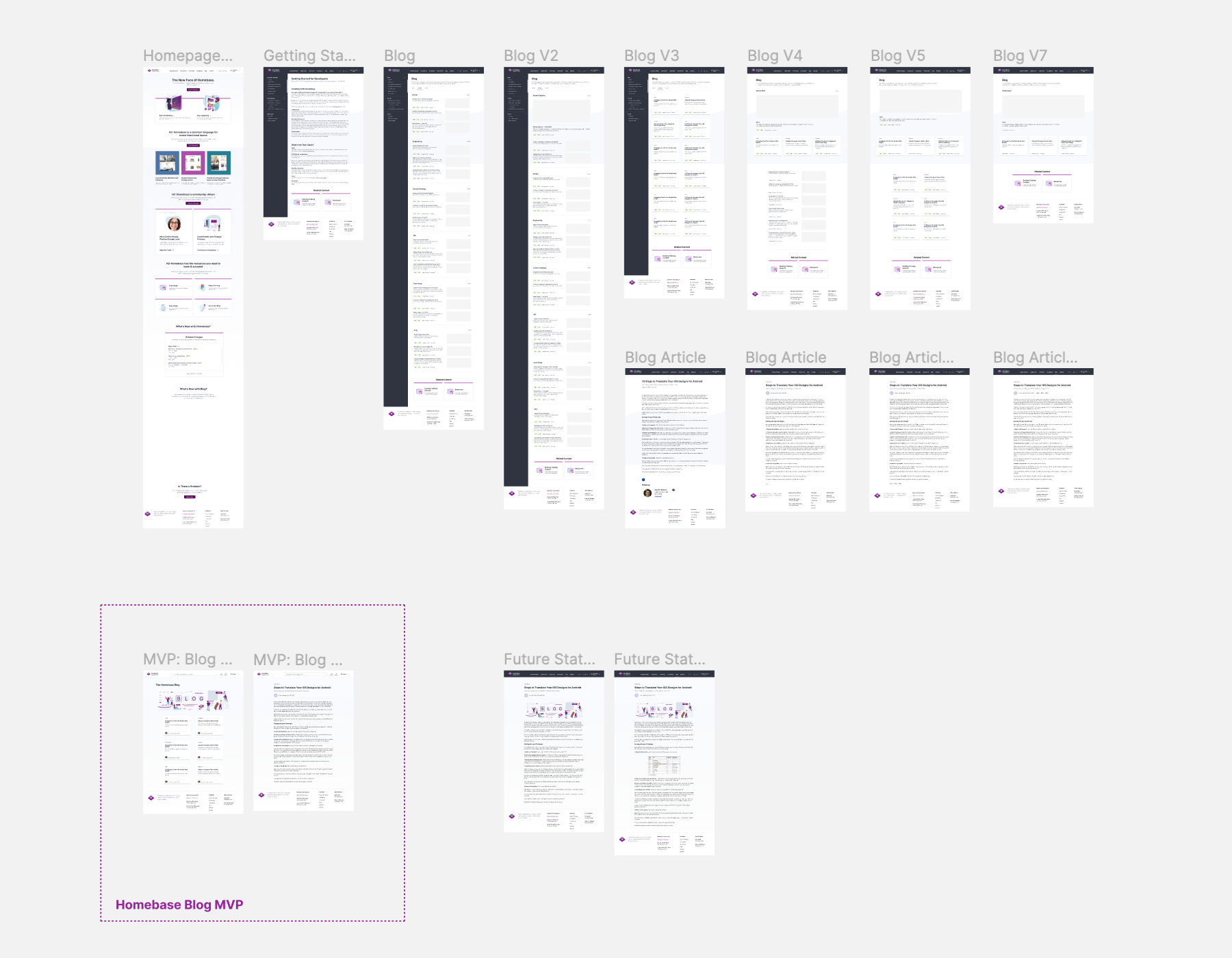
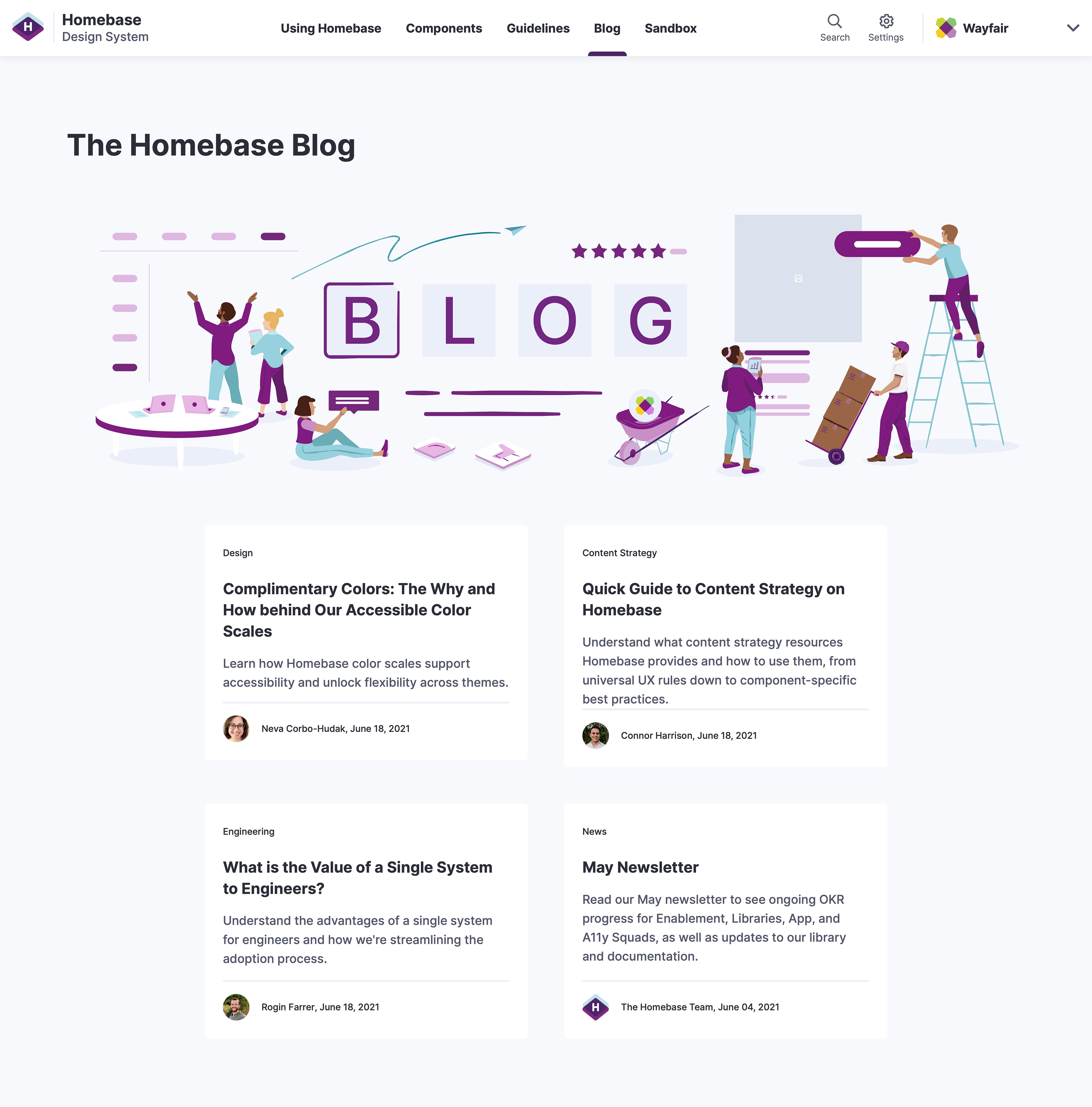
The Homebase Blog design
Background:
As Homebase continues to improve their value props, we have identified the need for a Blog page to keep content relevant and stay updated on Homebase news, articles, events and trainings.
As Homebase continues to improve their value props, we have identified the need for a Blog page to keep content relevant and stay updated on Homebase news, articles, events and trainings.
Goal:
Creation of the Homebase Blog that includes landing page and article page.
Creation of the Homebase Blog that includes landing page and article page.
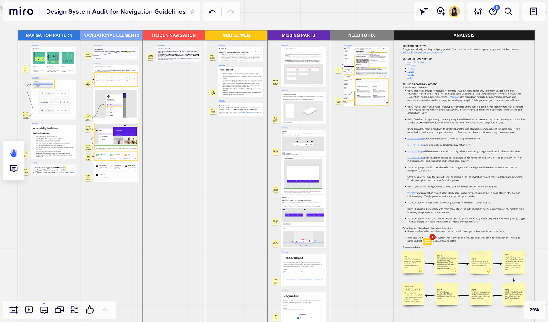
Design Audit for the Homebase Design System
Background:
As a Homebase team, we want users to be able to navigate through the Homebase Design System site with as little friction as possible.
As a Homebase team, we want users to be able to navigate through the Homebase Design System site with as little friction as possible.
Goal:
Analyze and identify existing design systems to figure out the best way to improve the navigation experience of our existing Homebase Design System site.
Analyze and identify existing design systems to figure out the best way to improve the navigation experience of our existing Homebase Design System site.
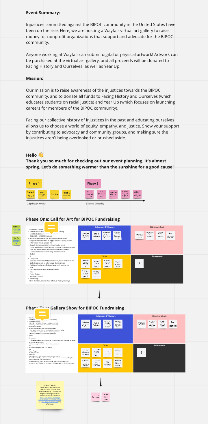
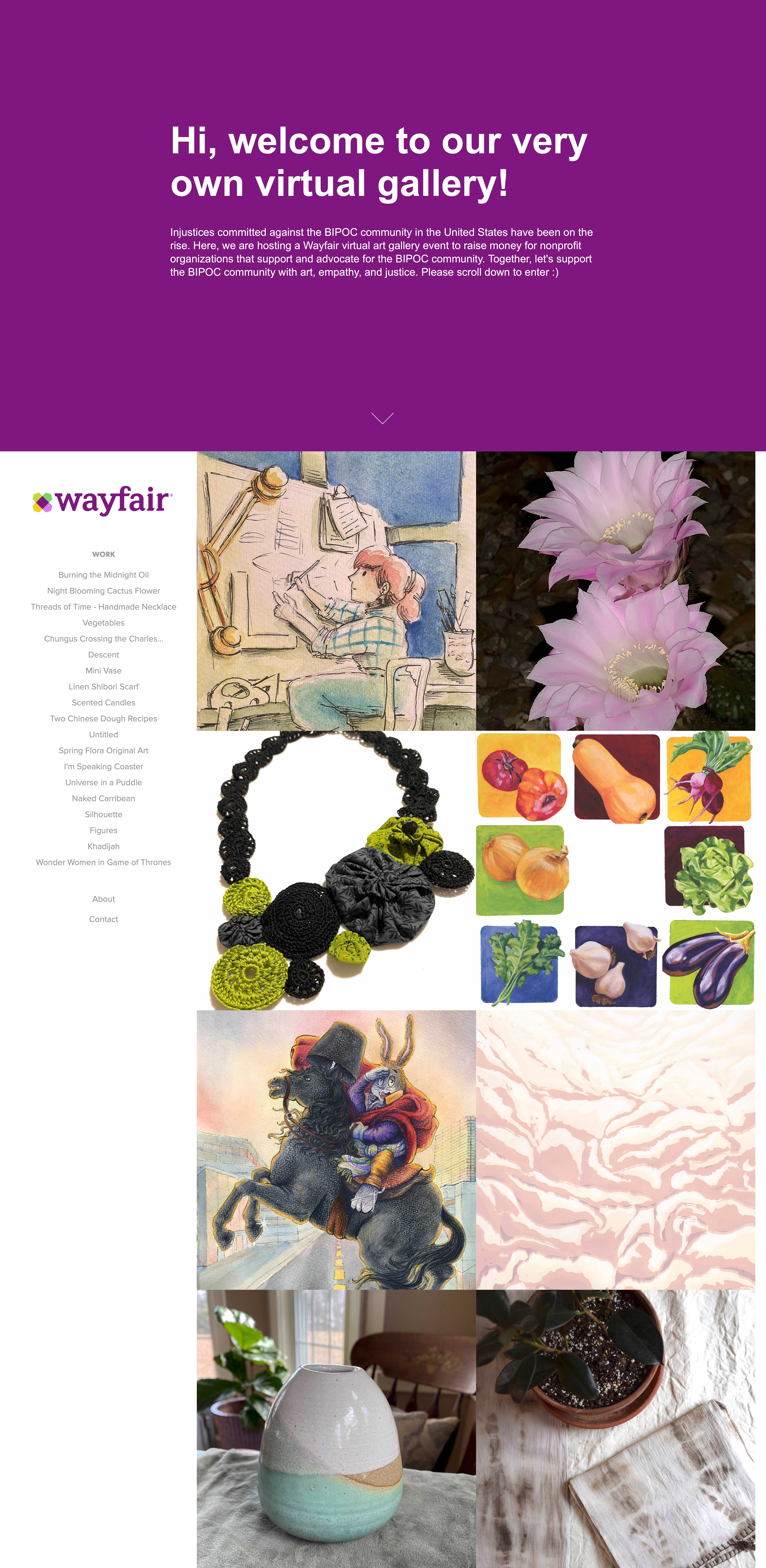
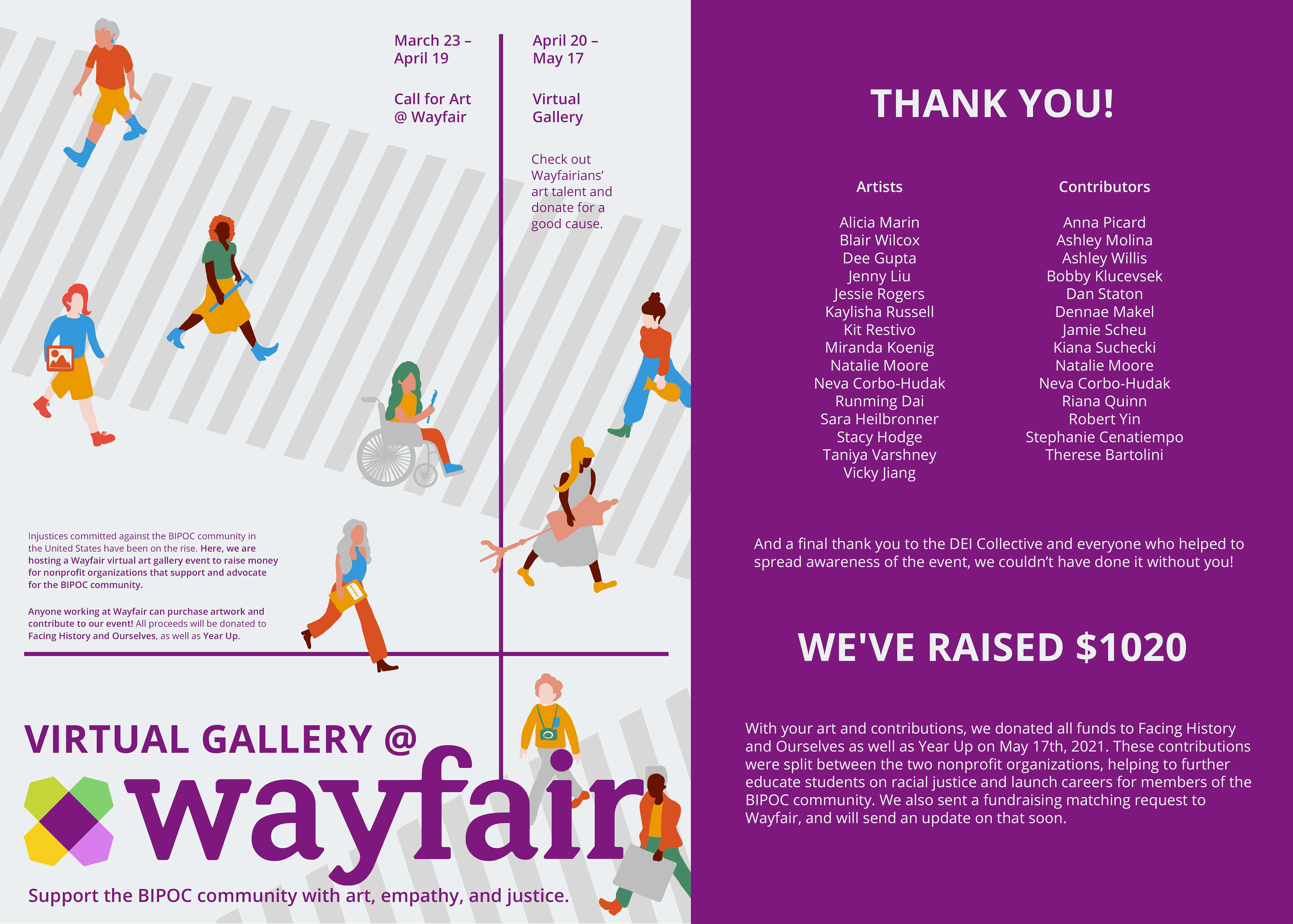
Virtual gallery @wayfair
Background:
Injustices committed against the BIPOC community in the United States have been on the rise. We are hosting a Wayfair virtual art gallery event to raise money for nonprofit organizations that support and advocate for the BIPOC community.
Injustices committed against the BIPOC community in the United States have been on the rise. We are hosting a Wayfair virtual art gallery event to raise money for nonprofit organizations that support and advocate for the BIPOC community.
Goal:
Our mission is to raise awareness of the injustices towards the BIPOC community, and to donate all funds to Facing History and Ourselves (which educates students on racial justice) and Year Up (which focuses on launching careers for members of the BIPOC community).
Our mission is to raise awareness of the injustices towards the BIPOC community, and to donate all funds to Facing History and Ourselves (which educates students on racial justice) and Year Up (which focuses on launching careers for members of the BIPOC community).

